Full Report
In speeches and promotional materials—often seeking to lure businesses to relocate to the South—policymakers, chambers of commerce, and corporate leaders across the region boast about their state’s low taxes, anti-union stances, and pro-business regulatory climates. For example, the website for Memphis Moves, an initiative of the greater Memphis Chamber, proudly states:
Tennessee is committed to providing an attractive business climate with a focus on low debt and a pro-business regulatory environment. Tennessee is proud to be a right-to-work state with no personal income tax on wages. Our state and local tax burdens are among the lowest in the country (Memphis Moves n.d.).
These sentiments, especially around unions, are shared by many Southern governors. For example, the governor of Alabama recently wrote:
Alabama has become a national leader in automotive manufacturing, and all this was achieved without a unionized workforce. In other words, our success has been home grown – done the Alabama way (Ivey 2024).
The governor of South Carolina shared a similar sentiment:
One thing we do not need is more labor unions… We have gotten where we are without them, and we do not need them now.
He continued:
We will fight. All the way to the gates of hell. And we will win (Harris 2024).
These statements highlight some of the major components of the Southern economic development model that politicians and business interests across many Southern states advocate for.1 As noted in the Memphis Moves quote, a key component of this model is ensuring the absolute minimal levels of regulation on businesses, including a lack of enforcement of labor laws or safety standards for workers (Cooper and Kroeger 2017; Fleischman and Franklin 2017; FPI 2024).
Each of the quotes underline policymakers and business interests’ hostility toward unions. Unions empower workers to advocate collectively to ensure they are paid livable wages and provided with basic benefits, such as health insurance, paid time off, and retirement benefits. Instead, politicians defend low wages for workers and the lack of regulation on businesses in their states, as well as the threadbare safety net in place across the South (Childers 2023).
Cash payments to help support poor families, for example, are distributed through a program known as Temporary Assistance to Needy Families (TANF). In 13 of 17 Southern states, a single mother with two children would receive a maximum monthly cash benefit of $500 or less. Some of the least generous benefits are in states like Alabama ($215), Arkansas ($204), Georgia ($280), Kentucky ($262), Mississippi ($260), North Carolina ($272), and Oklahoma ($292). This is compared with the $492 maximum monthly benefit in Michigan—the median state for TANF benefits in July 2022—and $1,151 in New Hampshire, the state with the most generous benefit (Thompson, Azevedo-McCaffrey, and Carr 2023).
The unemployment insurance benefit systems across the South are similarly stingy, with maximum weekly benefit amounts across the South being as low as $235 in Mississippi and $275 in Alabama, Florida, Louisiana, and Tennessee (The Century Foundation 2023).
While politicians across the South keep benefit levels for workers and families remarkably low, they further enrich wealthier Southerners and corporations by funneling them money that could be used to build out the social safety net, adequately fund schools, and provide public transportation. States across the South provide corporations with massive subsidies, tax breaks, and other incentives, such as the $1.3 billion South Carolina agreed to spend to attract Scout Motors or Georgia’s $1.8 billion in incentives to Hyundai to build electric vehicles in the state (AP 2022; Bustos and Hughes 2023).
Public officials’ stated goals for these subsidies is that they will attract jobs—good jobs—and drive growth in the region. But as we show in Figure B, Southern states are among the states with the lowest gross domestic product (GDP), whose job growth consistently falls behind population growth, and that have the lowest labor force participation rates of any region.
How we define the South
In this report, we use the U.S. Census Bureau’s definition of the South, which includes Alabama, Arkansas, Delaware, Florida, Georgia, Kentucky, Louisiana, Maryland, Mississippi, North Carolina, Oklahoma, South Carolina, Tennessee, Texas, Virginia, West Virginia, and the District of Columbia. Figure A shows the states that make up each of the regions compared in this series. When specific analyses focus on a subset of states, we note which states are included or excluded.
The South is made up of 16 states and the District of Columbia: Map of the four regions of the United States and the states that make up those regions
| State | Region | code |
|---|---|---|
| Alabama | South | 1 |
| Alaska | West | 2 |
| Arizona | West | 2 |
| Arkansas | South | 1 |
| California | West | 2 |
| Colorado | West | 2 |
| Connecticut | Northeast | 3 |
| Delaware | South | 1 |
| Washington D.C. | South | 1 |
| Florida | South | 1 |
| Georgia | South | 1 |
| Hawaii | West | 2 |
| Idaho | West | 2 |
| Illinois | Midwest | 4 |
| Indiana | Midwest | 4 |
| Iowa | Midwest | 4 |
| Kansas | Midwest | 4 |
| Kentucky | South | 1 |
| Louisiana | South | 1 |
| Maine | Northeast | 3 |
| Maryland | South | 1 |
| Massachusetts | Northeast | 3 |
| Michigan | Midwest | 4 |
| Minnesota | Midwest | 4 |
| Mississippi | South | 1 |
| Missouri | Midwest | 4 |
| Montana | West | 2 |
| Nebraska | Midwest | 4 |
| Nevada | West | 2 |
| New Hampshire | Northeast | 3 |
| New Jersey | Northeast | 3 |
| New Mexico | West | 2 |
| New York | Northeast | 3 |
| North Carolina | South | 1 |
| North Dakota | Midwest | 4 |
| Ohio | Midwest | 4 |
| Oklahoma | South | 1 |
| Oregon | West | 2 |
| Pennsylvania | Northeast | 3 |
| Rhode Island | Northeast | 3 |
| South Carolina | South | 1 |
| South Dakota | Midwest | 4 |
| Tennessee | South | 1 |
| Texas | South | 1 |
| Utah | West | 2 |
| Vermont | Northeast | 3 |
| Virginia | South | 1 |
| Washington | West | 2 |
| West Virginia | South | 1 |
| Wisconsin | Midwest | 4 |
| Wyoming | West | 2 |
Source: EPI analysis of U.S. Census Bureau 2021.
Southern states adopting the Southern economic development model have lower GDPs
The first indicator this report examines is the state-level gross domestic product (GDP). The GDP is the total value of goods and services produced in an economy. It is a comprehensive measure that represents overall spending by government, the output of businesses and their workers, investments made by actors in the economy, and the trade conducted with economic actors in other jurisdictions.
GDP grows when governments spend more money, when the demand for goods and services produced by businesses grows, when more resources are invested in the area, and when the productivity of workers and their employers increase. Productivity—the income generated from each hour of work—generally increases when workers, their employers, and their political leaders invest in education and job training; necessary capital investments such as machinery, digital technologies, and public infrastructure; and work supports such as living wages, fair scheduling policies, and paid leave. All these investments can help make workers more productive.
Overall GDP trends are heavily driven by national and often global macroeconomic forces, and regional or state GDP trends can differ significantly depending on how a particular state or region’s economy is implicated by those macroeconomic forces. For example, states with heavy tourism industries were particularly exposed to the effects of the COVID-19 pandemic, as the drop in travel and face-to-face services meant these states were more likely to experience a sharper drop in overall economic activity than states where tourism is less prominent.
Still, state and local policymakers have enormous power to shape the public services, educational opportunities, infrastructure, and other investments being made in regional economies. Similarly, policymakers and employers can powerfully influence both productivity and consumer demand through the choices they make governing job quality and investments in workers. As a result, GDP trends do vary by region and by state within regions.
Figure B shows the per capita GDP for the United States and for each region of the country in 2019, before the COVID-19 recession, and in 2022.2 If we look at the regions as the Census Bureau defines them, the South has the lowest per capita GDP in both 2019 ($67,220) and 2022 ($69,811).
The South, however, includes the District of Columbia (D.C.), which has the highest per capita GDP of any state. But D.C.’s unique position as a city-state and the seat of the federal government artificially raises the overall per capita GDP for the region. Notably, D.C. does not conform to the Southern economic development model. If we exclude D.C. from the analysis, Figure B shows that the GDP across the South is even lower. The GDP across the South falls even further if Maryland and Delaware—two more states that do not follow the Southern economic development model—are also excluded.
The South has the lowest per capita GDP of all regions and the Southern GDP declines further without D.C., Delaware, and Maryland: GDP per capita by region, 2019 and 2022
| Region | 2019 | 2022 |
|---|---|---|
| USA | $73,858 | $77,178 |
| Northeast | $86,942 | $88,211 |
| West | $79,072 | $84,341 |
| Midwest | $70,231 | $71,816 |
| South | $67,220 | $69,811 |
| South w/o DC | $66,327 | $68,888 |
| South w/o DC, MD, and DE | $65,550 | $68,263 |
Note: GDP per capita is state GDP divided by resident population. Regional GDP is state average weighted by population. GDP in 2022 dollars.
Source: EPI analysis of state GDP data from the Bureau of Econoimic Analysis and U.S. Census Bureau Resident Population data, retrieved from FRED, Federal Reserve Bank of St. Louis.
While this report uses the Census Bureau’s definition of the South, one could argue that D.C., Maryland, and Delaware should not be included in the region, since they were not part of the Confederacy and have not followed the Southern economic development model with their relatively higher wages, higher minimum wages, and greater protections for workers. For example, most states across the South either have no state minimum wage or have the minimum wage set at the federal rate of $7.25 per hour. D.C., however, has a minimum wage of $17, Maryland’s is $15, and Delaware’s is $13.25 (EPI 2024; Hickey 2023). None of these are so-called right-to-work states and all three have passed paid family and medical leave laws for workers (Williamson 2023). Including these states in the analysis, however, allows the data to show how taking a different policy path can bring ample benefits to workers and families.
Next, we examine GDP trends for individual states. Figure C shows the 2022 per capita GDP for the 10 states with the highest per capita GDPs. Just one Southern state—Delaware—is included among the top 10. The District of Columbia would also be among the 10 jurisdictions with the highest GDP but was omitted from these rankings for the reasons mentioned above.
Of the 10 states with the highest per capita GDP, just one—Delaware—is in the South: Ten states with the highest GDP per capita, 2022
| State | GDP per capita |
|---|---|
| New York | $104,121 |
| Massachusetts | $99,024 |
| Washington | $94,817 |
| California | $93,278 |
| North Dakota | $93,273 |
| Alaska | $89,596 |
| Connecticut | $88,493 |
| Delaware | $88,486 |
| Wyoming | $84,385 |
| Colorado | $84,110 |
Note: GDP per capita is state GDP divided by resident population. The District of Columbia was omitted from the ranking of state GDPs but if it were included, it would have the highest GDP. Values are in 2022 dollars.
Source: EPI analysis of state GDP data from the Bureau of Economic Analysis and U.S. Census Bureau Resident Population data, retrieved from FRED, Federal Reserve Bank of St. Louis.
Figure D shows the 10 states with the lowest per capita GDP. Seven of these 10 states are in the South—Alabama, Arkansas, Kentucky, Mississippi, Oklahoma, South Carolina, and West Virginia. Mississippi has the lowest GDP of all states. These Southern states follow the Southern economic development model, as opposed to states like Delaware and Maryland or the District of Columbia, which do not.
Seven of the 10 states with the lowest per capita GDP are in the South, Mississippi has the lowest of all states: Ten states with the lowest GDP per capita, 2022
| State | GDP per capita |
|---|---|
| Oklahoma | $60,394 |
| Montana | $59,732 |
| New Mexico | $59,400 |
| Kentucky | $57,404 |
| Idaho | $57,180 |
| South Carolina | $56,322 |
| Alabama | $55,494 |
| West Virginia | $54,913 |
| Arkansas | $54,487 |
| Mississippi | $47,628 |
Note: GDP per capita is state GDP divided by resident population. GDP in 2022 dollars.
Source: EPI analysis of state GDP data from the Bureau of Econoimic Analysis and U.S. Census Bureau Resident Population data, retrieved from FRED, Federal Reserve Bank of St. Louis.
GDP is an important measure of overall economic trends, but it is limited in its ability to provide an understanding of the experiences and living standards of average workers and their families. Only in the theoretical scenario where inequality is low and overall economic growth is equally shared do changes in GDP necessarily reflect the experience of the average individual or household. When economic gains go to fewer and fewer people, as has increasingly been the case in the South and across the country, changes in GDP disproportionately reflect the experiences of those at the top (Boushey and Clemens 2018; Clemens 2023).
To better understand the living conditions and experiences of average households in the South, we need to look at a variety of economic measures, particularly those describing households’ engagement with the labor market. Most households get the bulk, if not all, of their income through work. Thus, economic outcomes of workers in the South are key to understanding how the Southern model has impacted people in the region. Next, we examine various additional components of the Southern labor market to gain a more comprehensive understanding of work and workers across the South.
Before getting into labor market indicators, however, it’s important to emphasize how large the Southern population is, and how much it has grown. Population growth or decline is an important factor impacting a region’s GDP. And how the Southern population grows relative to other regions has consequential implications for the economic health of the country as a whole. The 17 states that make up the South were home to almost four in 10 Americans (38.1%) in 2020. Figure E shows how the share of the U.S. population that resides in each region has shifted between 1910 and 2020. The South not only has the largest population of any region in the nation, but also its population is the fastest growing.
The South has a larger population than any other region and the share is growing: Share of the United States population in each regions, 1910 to 2020
| Year | South Region | Northeast Region | Midwest Region | West Region |
|---|---|---|---|---|
| 1910 | 31.9% | 28.0% | 32.4% | 7.7% |
| 1920 | 31.2% | 28.0% | 32.1% | 8.7% |
| 1930 | 30.7% | 27.9% | 31.3% | 10.0% |
| 1940 | 31.5% | 27.2% | 30.4% | 10.9% |
| 1950 | 31.2% | 26.1% | 29.4% | 13.3% |
| 1960 | 30.7% | 24.9% | 28.8% | 15.6% |
| 1970 | 30.9% | 24.1% | 27.8% | 17.1% |
| 1980 | 33.3% | 21.7% | 26.0% | 19.1% |
| 1990 | 34.4% | 20.4% | 24.0% | 21.2% |
| 2000 | 35.6% | 19.0% | 22.9% | 22.5% |
| 2010 | 37.1% | 17.9% | 21.7% | 23.3% |
| 2020 | 38.1% | 17.4% | 20.8% | 23.7% |
Source: Author's analysis of U.S. Census Bureau’s Historical Population Change Data.
This growth in the share of the population living in the South reflects several factors, including natural increases—i.e., more births than deaths—as well as international immigration (especially across the Southern border, from South America and the Caribbean) and domestic migration to the region.
Politicians point to population growth across the South as evidence of the positive impacts of their policies, but strong population growth has not occurred uniformly across the region—despite the widespread adoption of the Southern model—and growth tends to be concentrated in specific states and cities. For example, Texas and Florida are two of the largest states in the nation and they had the highest population growth from 2021 to 2022, but Louisiana, West Virginia, Maryland, and Mississippi all saw their populations decline during the same period (U.S. Census Bureau 2022).
Many of those moving to the South from other regions are seeking cheaper housing (Henderson 2016). Land generally tends to be cheaper across the South, contributing to housing that is much more affordable than in places like California and New York. Texas and Florida’s populations also had some of the largest gains in international migration between 2021 and 2022 (U.S. Census Bureau 2022).
Another contributor that is largely ignored in discussions of population growth in the South is the fact that, beginning in the 1960s and 1970s, the use of air conditioning became more widespread across the region. Prior to that time, the oppressive heat during summer months along with high humidity left many Southerners in misery. This was fundamentally changed, however, by air conditioning in cars, homes, and businesses (Arsenault 1984). As Figure D shows, before 1970, the share of the population living in the South fluctuated between 30–32%. Since 1970, it has continued to increase in each subsequent decade.
Job growth across the South lags other regions
Many Southern politicians argue that the policies associated with the Southern economic development model that is common across Southern states—low wages, lax business regulations, zealous defense of so-called right-to-work laws—produce stronger job growth. When we examine the data, however, we find that job growth across the South has not outpaced population growth and, in most instances, it has failed to keep up with population growth.
The region’s underwhelming job growth is very likely a direct result of some of the Southern model’s intentional aims. Low wages and a weak safety net undermine workers and households’ spending power, reducing the overall demand for goods and services that might lead to stronger GDP and job growth. Similarly, with little union presence in the region, workers lack what has traditionally been a key vehicle for increasing workers’ share of overall income in the economy. Because low- and middle-income households tend to spend a larger share of their income than corporations and high-income households, if more income is captured by businesses and corporate shareholders, it can further depress overall demand for goods and services that could drive up GDP and spur faster job growth.
In Figure F, we compare job growth with the growth in the working-age population across each region. While the share of the U.S. population living in the Midwest and Northeast has declined since the late 1970s, the number of working-aged people in all regions increased. The data show that since the early 2000s, job growth has lagged population growth across the South. Figure F shows that between 1976 and the mid-2000s, Southern job growth had generally moved in tandem with population growth but never exceeded growth in the working-age population. Over the last decade and a half since the 2007–2009 Great Recession, job growth has failed to even keep up, indicating that job growth resulting from the Southern economic development model has not been particularly impressive. Indeed, compared with other regions, the Southern model fared no better than the rest of the country over the same period.
Job growth across the South fails to keep up with growth in the working-age population: Cumulative job growth and population growth across the South, 1977–2019
| Population growth | Job growth | |
|---|---|---|
| 1977 | 1,267,416 | 1,284,911 |
| 1978 | 2,532,334 | 2,935,998 |
| 1979 | 3,867,584 | 4,059,991 |
| 1980 | 5,201,833 | 4,751,510 |
| 1981 | 6,433,496 | 5,518,831 |
| 1982 | 7,630,166 | 5,620,934 |
| 1983 | 8,669,414 | 6,176,813 |
| 1984 | 9,630,667 | 7,952,282 |
| 1985 | 10,623,832 | 9,113,601 |
| 1986 | 11,513,750 | 9,748,660 |
| 1987 | 12,306,080 | 10,824,988 |
| 1988 | 12,978,833 | 12,122,672 |
| 1989 | 13,662,914 | 13,061,495 |
| 1990 | 14,926,611 | 13,969,456 |
| 1991 | 15,920,162 | 13,933,847 |
| 1992 | 16,877,144 | 14,444,984 |
| 1993 | 17,950,796 | 15,813,687 |
| 1994 | 19,038,362 | 17,142,019 |
| 1995 | 20,133,601 | 18,720,949 |
| 1996 | 21,271,247 | 19,937,982 |
| 1997 | 22,401,896 | 21,446,810 |
| 1998 | 23,498,718 | 22,905,917 |
| 1999 | 24,564,534 | 24,028,049 |
| 2000 | 25,532,544 | 25,459,512 |
| 2001 | 26,581,086 | 25,589,803 |
| 2002 | 27,645,876 | 25,662,589 |
| 2003 | 28,668,719 | 26,159,567 |
| 2004 | 29,824,155 | 27,453,926 |
| 2005 | 31,083,266 | 29,067,334 |
| 2006 | 32,408,346 | 30,734,429 |
| 2007 | 33,769,067 | 32,297,997 |
| 2008 | 34,952,955 | 32,349,656 |
| 2009 | 36,004,988 | 30,545,345 |
| 2010 | 37,706,291 | 30,436,865 |
| 2011 | 39,020,863 | 31,779,969 |
| 2012 | 40,139,552 | 32,850,120 |
| 2013 | 41,230,256 | 34,116,058 |
| 2014 | 42,395,433 | 35,728,792 |
| 2015 | 43,656,009 | 37,341,321 |
| 2016 | 44,927,358 | 38,576,692 |
| 2017 | 45,833,735 | 40,002,604 |
| 2018 | 46,817,141 | 41,765,484 |
| 2019 | 47,814,181 | 43,215,009 |
Note: Population growth refers to growth of the working-age population aged 16 and older.
Source: Population growth based on EPI analysis of population data from the state-level “Employment status of the civilian noninstitutional population, annual averages” from the Bureau of Labor Statistics. Job growth based on analysis of Regional Economic Information System employment data from the Bureau of Economic Analysis, U.S. Department of Commerce.
Figure G shows the same data for the remaining regions. While all regions experienced a decline in the number of jobs in the region during the 2007–2009 recession, Figure G shows that in the Northeast and Midwest, job growth consistently exceeded population growth although neither region grew as quickly as the South. Population and job growth in the West region was similar to that in the South.
Job growth exceeds growth in the working-age population across the Northeast and the Midwest: Job growth and working-age population growth in the Northeast, Midwest, and West, 1977–2019
Midwest
| Cumulative population growth | Cumulative job growth | |
|---|---|---|
| 1977 | 561,002 | 835,704 |
| 1978 | 1,081,584 | 1,813,172 |
| 1979 | 1,521,166 | 2,393,300 |
| 1980 | 1,898,665 | 1,875,964 |
| 1981 | 2,170,500 | 1,644,785 |
| 1982 | 2,287,085 | 968,459 |
| 1983 | 2,349,835 | 1,098,890 |
| 1984 | 2,523,334 | 2,168,187 |
| 1985 | 2,680,416 | 2,774,166 |
| 1986 | 2,970,750 | 3,305,687 |
| 1987 | 3,329,916 | 4,135,027 |
| 1988 | 3,652,667 | 4,896,430 |
| 1989 | 3,844,001 | 5,583,191 |
| 1990 | 3,470,007 | 6,142,720 |
| 1991 | 3,889,290 | 6,112,862 |
| 1992 | 4,289,818 | 6,349,528 |
| 1993 | 4,733,427 | 6,963,787 |
| 1994 | 5,122,040 | 7,960,062 |
| 1995 | 5,534,234 | 8,921,049 |
| 1996 | 5,958,930 | 9,536,491 |
| 1997 | 6,282,790 | 10,163,573 |
| 1998 | 6,579,400 | 10,863,329 |
| 1999 | 6,897,678 | 11,413,574 |
| 2000 | 7,207,812 | 12,104,673 |
| 2001 | 7,558,560 | 11,826,122 |
| 2002 | 7,890,482 | 11,462,053 |
| 2003 | 8,205,664 | 11,411,266 |
| 2004 | 8,499,267 | 11,784,466 |
| 2005 | 8,821,137 | 12,215,113 |
| 2006 | 9,178,117 | 12,606,555 |
| 2007 | 9,507,140 | 13,086,421 |
| 2008 | 9,800,189 | 12,840,347 |
| 2009 | 10,070,862 | 11,435,412 |
| 2010 | 10,295,249 | 11,247,783 |
| 2011 | 10,558,826 | 11,897,743 |
| 2012 | 10,830,835 | 12,349,477 |
| 2013 | 11,102,890 | 12,848,484 |
| 2014 | 11,355,746 | 13,408,073 |
| 2015 | 11,553,299 | 13,986,591 |
| 2016 | 11,760,714 | 14,349,753 |
| 2017 | 12,256,532 | 14,626,495 |
| 2018 | 12,459,014 | 15,084,556 |
| 2019 | 12,656,723 | 15,536,381 |
Northeast
| Cumulative population growth | Cumulative job growth | |
|---|---|---|
| 1977 | 276,082 | 422,204 |
| 1978 | 529,499 | 1,148,365 |
| 1979 | 788,751 | 1,760,831 |
| 1980 | 1,012,084 | 1,912,979 |
| 1981 | 1,317,416 | 2,008,549 |
| 1982 | 1,557,666 | 1,914,197 |
| 1983 | 1,811,251 | 2,162,643 |
| 1984 | 2,063,417 | 3,114,721 |
| 1985 | 2,243,583 | 3,794,339 |
| 1986 | 2,485,333 | 4,418,142 |
| 1987 | 2,737,417 | 4,881,080 |
| 1988 | 2,933,666 | 5,601,253 |
| 1989 | 3,004,751 | 5,786,778 |
| 1990 | 3,312,218 | 5,644,832 |
| 1991 | 3,406,538 | 4,854,629 |
| 1992 | 3,454,512 | 4,824,665 |
| 1993 | 3,581,985 | 5,035,361 |
| 1994 | 3,694,873 | 5,264,244 |
| 1995 | 3,837,681 | 5,567,799 |
| 1996 | 4,035,820 | 5,891,059 |
| 1997 | 4,237,876 | 6,356,642 |
| 1998 | 4,467,515 | 6,882,609 |
| 1999 | 4,712,572 | 7,474,755 |
| 2000 | 4,931,019 | 8,280,281 |
| 2001 | 5,202,122 | 8,359,551 |
| 2002 | 5,478,548 | 8,201,931 |
| 2003 | 5,734,418 | 8,237,511 |
| 2004 | 5,955,742 | 8,645,927 |
| 2005 | 6,180,024 | 9,062,673 |
| 2006 | 6,436,047 | 9,480,184 |
| 2007 | 6,691,971 | 10,108,142 |
| 2008 | 6,954,025 | 10,235,631 |
| 2009 | 7,217,799 | 9,476,141 |
| 2010 | 7,525,380 | 9,440,562 |
| 2011 | 7,831,076 | 9,995,304 |
| 2012 | 8,079,448 | 10,346,035 |
| 2013 | 8,285,356 | 10,831,335 |
| 2014 | 8,463,328 | 11,379,946 |
| 2015 | 8,580,227 | 12,031,171 |
| 2016 | 8,678,966 | 12,482,870 |
| 2017 | 9,689,991 | 12,833,107 |
| 2018 | 9,876,022 | 13,422,552 |
| 2019 | 10,017,315 | 13,972,918 |
West
| Cumulative population growth | Cumulative job growth | |
|---|---|---|
| 1977 | 904,332 | 908,181 |
| 1978 | 1,875,417 | 2,197,865 |
| 1979 | 2,842,750 | 3,341,778 |
| 1980 | 3,774,998 | 3,851,547 |
| 1981 | 4,498,916 | 4,150,635 |
| 1982 | 5,164,500 | 4,068,510 |
| 1983 | 5,763,666 | 4,616,154 |
| 1984 | 6,458,165 | 5,701,710 |
| 1985 | 7,168,249 | 6,523,394 |
| 1986 | 7,874,917 | 7,168,611 |
| 1987 | 8,598,584 | 8,116,105 |
| 1988 | 9,315,082 | 9,352,345 |
| 1989 | 10,056,333 | 10,155,136 |
| 1990 | 11,738,841 | 10,982,692 |
| 1991 | 12,372,253 | 11,120,262 |
| 1992 | 13,150,428 | 10,955,723 |
| 1993 | 13,809,853 | 11,370,365 |
| 1994 | 14,435,776 | 12,239,075 |
| 1995 | 15,065,619 | 13,114,803 |
| 1996 | 15,762,044 | 14,099,468 |
| 1997 | 16,622,385 | 14,982,975 |
| 1998 | 17,484,563 | 16,238,145 |
| 1999 | 18,316,568 | 17,023,722 |
| 2000 | 19,086,338 | 17,935,134 |
| 2001 | 19,932,891 | 18,155,524 |
| 2002 | 20,725,595 | 18,177,327 |
| 2003 | 21,457,733 | 18,521,956 |
| 2004 | 22,216,178 | 19,364,181 |
| 2005 | 23,008,526 | 20,402,080 |
| 2006 | 23,862,658 | 21,456,232 |
| 2007 | 24,653,887 | 22,459,940 |
| 2008 | 25,446,337 | 22,197,066 |
| 2009 | 26,188,500 | 20,588,602 |
| 2010 | 27,046,378 | 20,185,290 |
| 2011 | 27,788,208 | 20,827,484 |
| 2012 | 28,498,237 | 21,842,868 |
| 2013 | 29,186,275 | 22,938,023 |
| 2014 | 29,923,226 | 24,125,789 |
| 2015 | 30,708,957 | 25,375,517 |
| 2016 | 31,520,160 | 26,378,385 |
| 2017 | 32,115,153 | 27,283,694 |
| 2018 | 32,725,780 | 28,420,408 |
| 2019 | 33,272,323 | 29,493,992 |
Notes: Population growth refers to growth of the working-age population ages 16 and older. The composition of each region follows the census definitions.
Population growth refers to growth of the working-age population ages 16 and older. The composition of each region follows the census definitions. The South includes Alabama, Arkansas, Delaware, the District of Columbia, Florida, Georgia, Kentucky, Louisiana, Maryland, Mississippi, North Carolina, Oklahoma, South Carolina, Tennessee, Texas, Virginia, and West Virginia. The Midwest includes Illinois, Indiana, Iowa, Kansas, Michigan, Minnesota, Missouri, Nebraska, North Dakota, Ohio, South Dakota, and Wisconsin. The Northeast includes Connecticut, Maine, Massachusetts, New Hampshire, New Jersey, New York, Pennsylvania, Rhode Island, and Vermont. The West includes Alaska, Arizona, California, Colorado, Hawaii, Idaho, Montana, Nevada, New Mexico, Oregon, Utah, Washington, and Wyoming.
Sources: Population growth based on EPI analysis of population data from the state-level “Employment status of the civilian noninstitutional population, annual averages” from the Bureau of Labor Statistics. Data on job growth based on analysis of Regional Economic Information System data from the Bureau of Economic Analysis, U.S. Department of Commerce.
Figure H shows that this regional pattern is not being driven by just a few large states such as Florida and Texas, which experienced large increases in their populations. In most states in the region, whether the population was growing or declining, job growth lagged population growth. Mississippi is one example of a state that has had its overall population as well as its working-age population decline over the past few years but still has been unable to generate enough jobs to match the size of the working-age population (St. Louis Federal Reserve 2023).3
States across the South struggle with job growth that consistently lags population growth: Job growth relative to population growth for select Southern states, 1977–2019
Mississippi
| Year | Population growth | Job growth |
|---|---|---|
| 1977 | 33,416 | 31,926 |
| 1978 | 64,833 | 61,723 |
| 1979 | 91,166 | 75,548 |
| 1980 | 113,833 | 72,486 |
| 1981 | 137,416 | 67,769 |
| 1982 | 156,916 | 40,391 |
| 1983 | 168,583 | 48,754 |
| 1984 | 183,250 | 78,213 |
| 1985 | 207,416 | 85,103 |
| 1986 | 211,416 | 91,926 |
| 1987 | 220,000 | 102,516 |
| 1988 | 228,500 | 130,210 |
| 1989 | 236,416 | 150,064 |
| 1990 | 237,079 | 163,776 |
| 1991 | 257,968 | 172,121 |
| 1992 | 271,774 | 194,874 |
| 1993 | 293,580 | 248,092 |
| 1994 | 318,636 | 295,873 |
| 1995 | 345,025 | 326,610 |
| 1996 | 368,248 | 350,410 |
| 1997 | 389,721 | 376,503 |
| 1998 | 410,527 | 406,602 |
| 1999 | 427,500 | 430,880 |
| 2000 | 439,214 | 437,468 |
| 2001 | 447,023 | 417,165 |
| 2002 | 454,787 | 415,947 |
| 2003 | 463,475 | 414,077 |
| 2004 | 478,072 | 424,817 |
| 2005 | 486,157 | 434,889 |
| 2006 | 491,479 | 469,487 |
| 2007 | 514,481 | 499,975 |
| 2008 | 529,739 | 498,604 |
| 2009 | 542,529 | 453,463 |
| 2010 | 570,965 | 451,904 |
| 2011 | 587,961 | 471,114 |
| 2012 | 596,844 | 480,892 |
| 2013 | 606,956 | 493,756 |
| 2014 | 615,322 | 517,926 |
| 2015 | 621,786 | 529,391 |
| 2016 | 628,009 | 541,046 |
| 2017 | 627,177 | 551,134 |
| 2018 | 623,146 | 562,901 |
| 2019 | 622,978 | 578,603 |
South Carolina
| Year | Population growth | Job growth |
|---|---|---|
| 1977 | 53,833 | 34,763 |
| 1978 | 110,250 | 89,901 |
| 1979 | 162,000 | 130,560 |
| 1980 | 213,833 | 147,048 |
| 1981 | 259,166 | 159,803 |
| 1982 | 299,916 | 137,414 |
| 1983 | 333,666 | 171,055 |
| 1984 | 371,083 | 248,551 |
| 1985 | 419,083 | 278,670 |
| 1986 | 447,916 | 320,745 |
| 1987 | 487,916 | 361,681 |
| 1988 | 525,583 | 432,572 |
| 1989 | 558,583 | 481,867 |
| 1990 | 604,426 | 536,306 |
| 1991 | 656,342 | 509,729 |
| 1992 | 692,328 | 521,024 |
| 1993 | 732,063 | 555,018 |
| 1994 | 767,632 | 602,542 |
| 1995 | 806,535 | 661,612 |
| 1996 | 843,687 | 703,908 |
| 1997 | 890,422 | 764,346 |
| 1998 | 938,408 | 814,999 |
| 1999 | 982,143 | 864,249 |
| 2000 | 1,019,950 | 903,378 |
| 2001 | 1,056,774 | 880,130 |
| 2002 | 1,091,322 | 871,600 |
| 2003 | 1,126,498 | 887,330 |
| 2004 | 1,171,228 | 929,223 |
| 2005 | 1,226,632 | 979,850 |
| 2006 | 1,298,020 | 1,042,185 |
| 2007 | 1,367,131 | 1,105,884 |
| 2008 | 1,432,557 | 1,095,982 |
| 2009 | 1,483,031 | 991,445 |
| 2010 | 1,557,202 | 981,186 |
| 2011 | 1,604,631 | 1,050,968 |
| 2012 | 1,648,098 | 1,076,841 |
| 2013 | 1,696,864 | 1,124,351 |
| 2014 | 1,751,585 | 1,188,007 |
| 2015 | 1,814,992 | 1,260,297 |
| 2016 | 1,880,588 | 1,323,594 |
| 2017 | 1,890,228 | 1,383,725 |
| 2018 | 1,941,031 | 1,469,947 |
| 2019 | 1,995,184 | 1,525,095 |
Georgia
| Year | Population growth | Job growth |
|---|---|---|
| 1977 | 88,583 | 103,190 |
| 1978 | 174,417 | 221,326 |
| 1979 | 270,917 | 300,579 |
| 1980 | 362,583 | 341,184 |
| 1981 | 452,333 | 376,504 |
| 1982 | 526,917 | 393,511 |
| 1983 | 592,083 | 477,293 |
| 1984 | 683,333 | 668,082 |
| 1985 | 801,833 | 807,258 |
| 1986 | 892,167 | 935,327 |
| 1987 | 995,417 | 1,033,364 |
| 1988 | 1,077,083 | 1,145,260 |
| 1989 | 1,142,083 | 1,208,702 |
| 1990 | 1,315,395 | 1,264,486 |
| 1991 | 1,418,868 | 1,222,533 |
| 1992 | 1,527,748 | 1,298,544 |
| 1993 | 1,643,712 | 1,466,661 |
| 1994 | 1,774,259 | 1,620,419 |
| 1995 | 1,902,223 | 1,788,538 |
| 1996 | 2,034,020 | 1,933,865 |
| 1997 | 2,169,567 | 2,049,199 |
| 1998 | 2,295,115 | 2,208,457 |
| 1999 | 2,416,995 | 2,329,248 |
| 2000 | 2,536,659 | 2,461,308 |
| 2001 | 2,668,816 | 2,472,312 |
| 2002 | 2,792,966 | 2,458,786 |
| 2003 | 2,908,028 | 2,495,745 |
| 2004 | 3,031,948 | 2,622,188 |
| 2005 | 3,190,050 | 2,796,331 |
| 2006 | 3,357,049 | 2,958,536 |
| 2007 | 3,514,919 | 3,091,186 |
| 2008 | 3,639,659 | 3,051,385 |
| 2009 | 3,742,839 | 2,847,520 |
| 2010 | 3,764,605 | 2,811,850 |
| 2011 | 3,823,287 | 2,926,114 |
| 2012 | 3,918,893 | 2,985,070 |
| 2013 | 4,001,652 | 3,097,281 |
| 2014 | 4,095,112 | 3,271,233 |
| 2015 | 4,204,361 | 3,433,083 |
| 2016 | 4,327,343 | 3,572,465 |
| 2017 | 4,437,794 | 3,725,056 |
| 2018 | 4,539,511 | 3,885,105 |
| 2019 | 4,646,061 | 4,019,250 |
Florida
| Year | Population growth | Job growth |
|---|---|---|
| 1977 | 211,167 | 199,132 |
| 1978 | 461,583 | 509,157 |
| 1979 | 770,417 | 724,404 |
| 1980 | 1,100,583 | 957,678 |
| 1981 | 1,396,583 | 1,135,531 |
| 1982 | 1,647,667 | 1,223,723 |
| 1983 | 1,889,083 | 1,437,100 |
| 1984 | 2,145,750 | 1,771,815 |
| 1985 | 2,401,917 | 2,042,100 |
| 1986 | 2,656,917 | 2,285,383 |
| 1987 | 2,917,000 | 2,363,780 |
| 1988 | 3,151,583 | 2,660,441 |
| 1989 | 3,381,833 | 2,866,444 |
| 1990 | 3,752,029 | 3,010,446 |
| 1991 | 3,976,655 | 2,987,738 |
| 1992 | 4,180,834 | 3,032,972 |
| 1993 | 4,377,513 | 3,272,608 |
| 1994 | 4,598,359 | 3,504,494 |
| 1995 | 4,826,039 | 3,764,327 |
| 1996 | 5,065,135 | 4,009,886 |
| 1997 | 5,312,564 | 4,275,293 |
| 1998 | 5,547,827 | 4,587,358 |
| 1999 | 5,772,589 | 4,848,041 |
| 2000 | 5,980,280 | 5,151,436 |
| 2001 | 6,221,444 | 5,209,104 |
| 2002 | 6,485,202 | 5,325,872 |
| 2003 | 6,738,147 | 5,553,554 |
| 2004 | 7,049,863 | 5,914,483 |
| 2005 | 7,385,684 | 6,337,346 |
| 2006 | 7,654,723 | 6,654,023 |
| 2007 | 7,830,230 | 6,801,417 |
| 2008 | 7,968,369 | 6,539,656 |
| 2009 | 8,080,442 | 6,112,040 |
| 2010 | 8,431,260 | 6,075,311 |
| 2011 | 8,700,663 | 6,306,791 |
| 2012 | 8,929,001 | 6,519,181 |
| 2013 | 9,163,642 | 6,809,412 |
| 2014 | 9,438,214 | 7,207,323 |
| 2015 | 9,757,345 | 7,637,317 |
| 2016 | 10,107,129 | 7,943,639 |
| 2017 | 10,309,377 | 8,355,479 |
| 2018 | 10,552,122 | 8,817,742 |
| 2019 | 10,764,996 | 9,127,205 |
Note: Population growth refers to growth of the working-age population aged 16 and older.
Source: Population growth based on EPI analysis of population data from the state-level “Employment status of the civilian noninstitutional population, annual averages” from the Bureau of Labor Statistics. Job growth based on analysis of Regional Economic Information System employment data from the Bureau of Economic Analysis, U.S. Department of Commerce.
Labor force participation
The fact that job growth lags growth in the working-age population across the South indicates that labor force participation across the South may also lag other regions. The labor force participation rate is a key indicator used to convey the health of the labor market, as it shows the share of the population ages 16 and older that is either employed or unemployed but actively looking for work.
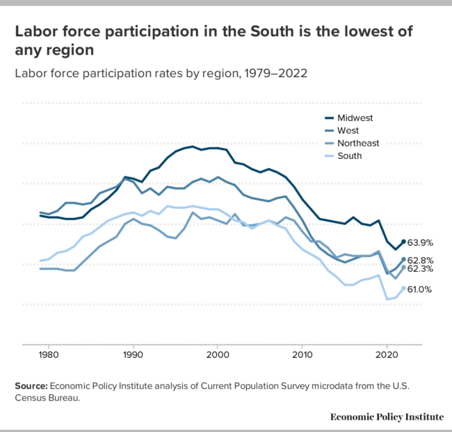
Figure I shows trends in the labor force participation rate for workers 16 and older from 1979 through 2022 for each region of the country. The South had the second lowest labor force participation rate of any region from 1979 until the 2007–2009 Great Recession. Since the Great Recession, the South has had the lowest labor force participation rate of all regions. The Midwest has had the highest labor force participation rates since the 1990s, followed by Western states.4
Labor force participation in the South is the lowest of any region: Labor force participation rates by region, 1979–2022
| South | Midwest | Northeast | West | |
|---|---|---|---|---|
| 1979 | 62.7% | 65.5% | 62.2% | 65.7% |
| 1980 | 62.8% | 65.4% | 62.2% | 65.6% |
| 1981 | 63.2% | 65.4% | 62.2% | 65.8% |
| 1982 | 63.3% | 65.3% | 62.1% | 66.3% |
| 1983 | 63.6% | 65.3% | 62.1% | 66.3% |
| 1984 | 64.2% | 65.4% | 62.6% | 66.2% |
| 1985 | 64.4% | 65.9% | 63.1% | 66.3% |
| 1986 | 64.8% | 66.2% | 63.6% | 66.9% |
| 1987 | 65.2% | 66.6% | 63.9% | 67.1% |
| 1988 | 65.4% | 67.1% | 64.2% | 67.3% |
| 1989 | 65.6% | 67.9% | 65.0% | 67.8% |
| 1990 | 65.7% | 67.8% | 65.3% | 67.6% |
| 1991 | 65.5% | 67.6% | 65.0% | 66.9% |
| 1992 | 65.8% | 68.3% | 64.9% | 67.2% |
| 1993 | 65.6% | 68.5% | 64.6% | 66.8% |
| 1994 | 66.1% | 69.1% | 64.2% | 67.3% |
| 1995 | 66.0% | 69.5% | 64.1% | 67.2% |
| 1996 | 66.0% | 69.7% | 64.7% | 67.2% |
| 1997 | 66.1% | 69.8% | 65.7% | 67.6% |
| 1998 | 66.0% | 69.6% | 65.3% | 67.8% |
| 1999 | 65.9% | 69.7% | 65.4% | 67.6% |
| 2000 | 65.9% | 69.7% | 65.2% | 67.9% |
| 2001 | 65.6% | 69.6% | 65.0% | 67.6% |
| 2002 | 65.2% | 68.8% | 65.6% | 67.4% |
| 2003 | 65.1% | 68.7% | 64.9% | 66.8% |
| 2004 | 64.7% | 68.4% | 64.9% | 66.6% |
| 2005 | 65.0% | 68.2% | 65.0% | 66.5% |
| 2006 | 65.2% | 68.4% | 65.2% | 66.4% |
| 2007 | 64.9% | 68.2% | 65.0% | 66.6% |
| 2008 | 64.7% | 67.9% | 65.4% | 66.7% |
| 2009 | 63.9% | 67.3% | 65.2% | 66.0% |
| 2010 | 63.4% | 66.5% | 64.5% | 65.2% |
| 2011 | 63.1% | 65.9% | 63.9% | 64.2% |
| 2012 | 62.8% | 65.3% | 63.9% | 63.5% |
| 2013 | 62.1% | 65.2% | 63.5% | 63.1% |
| 2014 | 61.7% | 65.1% | 62.9% | 62.8% |
| 2015 | 61.2% | 65.0% | 63.1% | 62.6% |
| 2016 | 61.2% | 65.4% | 63.0% | 62.8% |
| 2017 | 61.5% | 65.0% | 63.0% | 63.0% |
| 2018 | 61.6% | 64.9% | 63.0% | 63.0% |
| 2019 | 61.8% | 65.2% | 63.3% | 63.2% |
| 2020 | 60.3% | 63.9% | 62.1% | 61.9% |
| 2021 | 60.4% | 63.4% | 61.6% | 62.2% |
| 2022 | 61.0% | 63.9% | 62.3% | 62.8% |
Source: Economic Policy Institute analysis of Current Population Survey microdata from the U.S. Census Bureau.
Notably, Figure J shows that this lower labor force participation rate across the South is driven by white Southerners who make up the largest share of the population (U.S. Census Bureau 2023). The labor force participation rate for white Southerners is below 60%, lower than for white workers in any other region. It is also in contrast to the labor force participation rates of other racial and ethnic groups in the region. Black Southerners have a labor force participation rate of 62%, higher than Black Americans in any other region except those living in Western states, where it stands at 63.3%. Hispanic Southerners have a labor force participation rate of 66% and their labor force participation rate is only higher in the Midwest, where it is 70.8%. Asian Southerners have a labor force participation rate of 65.7%, the second highest of all groups.
Across regional racial and ethnic groups, white Southerners have the lowest labor force participation rate of all groups: Labor force participation rates by region, race, and ethnicity
| White | Black | Hispanic | Asian | |
|---|---|---|---|---|
| South | 59.2% | 62.0% | 66.0% | 65.7% |
| Northeast | 62.5% | 61.3% | 64.2% | 63.7% |
| West | 61.2% | 63.3% | 65.7% | 62.5% |
| Midwest | 64.4% | 60.7% | 70.8% | 66.5% |
Note: Hispanic workers may be of any race.
Source: EPI analysis of 2017–2021 Current Population Survey data.
The labor force participation rate provides a good overview of the health of the region’s economy but is also limited in the amount of information it provides when considered in isolation. It cannot tell us, for example, what shares of people are unemployed or actually have a job. In the next two sections, we examine unemployment, and employment as a share of the prime-age population. While these measures provide limited information in isolation, together, they offer a better understanding of how well the economic development model in place across the South is utilizing labor.
Unemployment
We begin with the unemployment rate, which is one of the most frequently referenced statistics to describe labor market conditions. Generally, an unemployment rate lower than 5% is considered a sign of a relatively healthy labor market (Wolla n.d.). However, changes in the unemployment rate can occur for a variety of reasons—some good and some bad—so it is important to understand what this indicator actually measures.
Individuals are counted as unemployed if they do not have a job but are actively looking for and are available for work (BLS 2015). When workers become discouraged and stop looking for work, they are no longer considered unemployed and are no longer counted as part of the labor force. This can cause the unemployment rate to fall even though large segments of the population who would like to work still do not have a job. It is also the case that when discouraged workers believe the economy is tightening or improving, they often reenter the labor market to actively look for work. This can cause the unemployment rate to increase as the labor force grows, even though the economy is recovering.
Figure K shows the unemployment rate by region for 2019, 2020, and 2021. Except for the Midwest in 2021, the South consistently has the lowest rates of unemployment, both before and after the pandemic. In 2019, unemployment rates were well below 5% for all regions. Data for 2020 and 2021 are provided to show how regions were impacted by the pandemic. While unemployment rates increased in all regions, they remained lower in the South than in other regions of the country with the exception of the Midwest in 2021.
The lower unemployment rate for the South might be seen as an indicator of the success of the Southern economic development model, but this is unlikely given the lower labor force participation rates above. Their lower unemployment rate, rather, masks a lot of discouraged job seekers and economic hardship as the data in Figure K will show. While unemployment rates fell further by 2021, they remained much higher than their pre-pandemic levels across regions.
Unemployment rates are consistently lower across the South than in other regions, even during the pandemic: Unemployment rates by region, 2019–2021
| 2019 | 2020 | 2021 | |
|---|---|---|---|
| Northeast | 3.7% | 9.2% | 6.4% |
| West | 3.9% | 9.1% | 6.2% |
| Midwest | 3.6% | 7.5% | 4.6% |
| South | 3.5% | 7.2% | 4.8% |
Source: EPI analysis of CPS microdata.
While pre-pandemic unemployment rates were low nationally and across the South, it is important to note that they were not equally low for all groups of workers. In fact, whether unemployment rates are high or low, Black workers have historically had unemployment rates twice that of their white counterparts nationally and across every region of the country, including the South (Williams and Wilson 2019).
Figure L shows the unemployment rate for workers across the South by race and ethnicity for the largest racial and ethnic groups in the region. Consistent with national data, Black workers across the South have unemployment rates at least twice that of their white counterparts across the last four decades. While Hispanic workers have lower unemployment rates than Black workers, their rates are also consistently higher than that of their white counterparts.
Black workers across the South consistently have unemployment rates twice that of their white counterparts: Unemployment rates across the South by race and ethnicity, 1979–2022
| White | Black | Hispanic | |
|---|---|---|---|
| 1979 | 4.2% | 11.0% | 7.1% |
| 1980 | 5.2% | 12.7% | 8.4% |
| 1981 | 5.5% | 14.1% | 8.0% |
| 1982 | 7.1% | 17.2% | 11.0% |
| 1983 | 7.1% | 18.2% | 11.8% |
| 1984 | 5.4% | 14.7% | 8.9% |
| 1985 | 5.4% | 14.1% | 9.1% |
| 1986 | 5.8% | 13.9% | 10.3% |
| 1987 | 5.2% | 12.7% | 9.3% |
| 1988 | 4.6% | 11.5% | 9.4% |
| 1989 | 4.2% | 10.7% | 8.8% |
| 1990 | 4.2% | 11.0% | 8.2% |
| 1991 | 5.4% | 11.6% | 8.6% |
| 1992 | 5.5% | 13.1% | 9.6% |
| 1993 | 4.9% | 12.1% | 8.7% |
| 1994 | 4.4% | 10.6% | 8.3% |
| 1995 | 4.1% | 9.6% | 8.6% |
| 1996 | 3.8% | 9.9% | 7.5% |
| 1997 | 3.5% | 9.4% | 7.0% |
| 1998 | 3.1% | 8.4% | 6.0% |
| 1999 | 3.0% | 7.5% | 5.6% |
| 2000 | 2.9% | 7.2% | 4.8% |
| 2001 | 3.5% | 8.5% | 5.7% |
| 2002 | 4.3% | 9.6% | 6.8% |
| 2003 | 4.3% | 9.9% | 7.1% |
| 2004 | 4.0% | 9.6% | 5.8% |
| 2005 | 3.7% | 9.5% | 5.1% |
| 2006 | 3.5% | 8.4% | 4.1% |
| 2007 | 3.4% | 7.5% | 4.6% |
| 2008 | 4.4% | 9.1% | 6.1% |
| 2009 | 7.4% | 13.9% | 10.0% |
| 2010 | 7.5% | 15.2% | 10.4% |
| 2011 | 6.9% | 15.2% | 9.4% |
| 2012 | 6.1% | 13.0% | 8.1% |
| 2013 | 5.5% | 12.2% | 7.3% |
| 2014 | 4.7% | 10.5% | 5.9% |
| 2015 | 4.1% | 9.1% | 5.4% |
| 2016 | 3.9% | 8.1% | 4.7% |
| 2017 | 3.4% | 7.2% | 4.4% |
| 2018 | 2.9% | 6.3% | 4.1% |
| 2019 | 2.8% | 5.8% | 3.7% |
| 2020 | 5.6% | 10.2% | 8.8% |
| 2021 | 3.6% | 7.4% | 5.8% |
| 2022 | 2.7% | 5.3% | 3.6% |
Source: EPI analysis of the U.S. Census Bureau’s Current Population Survey.
Black workers in particular have higher rates of unemployment overall and higher rates when compared with white workers of the same age and with the same levels of education (Ajilore 2020; Williams and Wilson 2019; Wilson and Darity Jr. 2022). This reflects the discrimination that Black workers face when looking for jobs. Black men without a criminal record, for example, are less likely to receive a call back from employers than White workers with a criminal record (Pager 2003).
Black workers in the U.S. and across the South also face much higher rates of criminalization and incarceration which further disadvantages them in the labor market (Childers 2024; Mast forthcoming). In 2021, the U.S. imprisoned 664 per 100,000 people. This is much higher than our peer nations including the United Kingdom (129) and Canada (104).
Despite the U.S. having an exceedingly high incarceration rate internationally, 13 of the 17 Southern states have incarceration rates that are even higher, with the highest rates in Louisiana (1094), Mississippi (1031), and Oklahoma (993). Black Americans are disproportionately represented among these prison populations, with Black Americans being just over 32% of the population in Louisiana but accounting for 66% of the state’s incarcerated population in prisons (PPI 2021a). In Mississippi, Black Americans are 37% of the population, but 61% of the prison population (PPI 2021b). And in Oklahoma, Black Americans are just over 7% of the population, but they are 27% of the incarcerated population (PPI 2021c).
Prime-age (25–54) employment-to-population ratio (EPOP)
Finally, the prime-age employment-to-population ratio (EPOP) is arguably the best individual measure of the health of the labor market. The prime-age EPOP refers to the share of the population ages 25–54 that is currently employed. One strength of this measure is that the EPOP does not fluctuate based on the movement of workers into or out of the labor market—be it due to dissatisfaction with job prospects or more innocuous movements typical at different life stages. For instance, by focusing on just workers ages 25 through 54, this measure is unaffected by young people finishing their education and older workers moving into retirement. This is particularly important for states like Florida, with large retiree populations. Figure M shows the EPOP for each region of the country. Consistent with the data on labor force participation, the South lags much of the country in the share of the prime-age population that is employed.
Differences across regions were negligible in the late 1970s and early 1980s, but in the late 1980s, the regions began to show a significant divergence. The South and West fell behind the Northeast and Midwest in the early 2000s. The South continues to have one of the lowest EPOPs of all regions since the early 2000s.
The South trails much of the nation in the share of its available workforce with a job: Prime-age employment-to-population ratio (EPOP) by region, 1979–2022
| South | West | Northeast | Midwest | |
|---|---|---|---|---|
| 1979 | 74.8% | 75.4% | 73.0% | 75.4% |
| 1980 | 74.7% | 75.3% | 73.1% | 74.1% |
| 1981 | 75.1% | 75.3% | 73.7% | 74.7% |
| 1982 | 73.8% | 74.3% | 73.1% | 73.1% |
| 1983 | 74.0% | 74.3% | 73.3% | 73.5% |
| 1984 | 76.3% | 76.1% | 75.3% | 75.7% |
| 1985 | 77.1% | 76.9% | 76.3% | 76.5% |
| 1986 | 76.9% | 77.4% | 77.6% | 77.7% |
| 1987 | 78.0% | 78.2% | 78.8% | 78.8% |
| 1988 | 78.7% | 79.2% | 79.2% | 79.9% |
| 1989 | 79.4% | 79.8% | 79.7% | 80.9% |
| 1990 | 79.4% | 79.1% | 79.3% | 80.9% |
| 1991 | 78.6% | 77.8% | 77.7% | 80.3% |
| 1992 | 78.3% | 77.0% | 76.9% | 80.7% |
| 1993 | 78.6% | 76.9% | 77.5% | 81.0% |
| 1994 | 79.2% | 77.9% | 77.6% | 82.0% |
| 1995 | 79.6% | 78.2% | 78.2% | 82.9% |
| 1996 | 79.9% | 78.4% | 79.3% | 83.2% |
| 1997 | 80.3% | 79.3% | 80.1% | 83.9% |
| 1998 | 80.6% | 79.5% | 80.5% | 83.9% |
| 1999 | 81.0% | 79.7% | 80.9% | 84.3% |
| 2000 | 81.1% | 80.1% | 80.9% | 83.8% |
| 2001 | 79.9% | 79.4% | 80.2% | 82.9% |
| 2002 | 78.5% | 78.1% | 79.5% | 81.6% |
| 2003 | 78.2% | 77.6% | 78.8% | 81.0% |
| 2004 | 78.3% | 78.1% | 79.2% | 80.8% |
| 2005 | 78.9% | 78.4% | 79.4% | 81.1% |
| 2006 | 79.1% | 79.3% | 79.8% | 81.6% |
| 2007 | 79.3% | 79.5% | 79.9% | 81.4% |
| 2008 | 78.3% | 78.4% | 79.8% | 80.5% |
| 2009 | 75.1% | 74.8% | 77.0% | 77.0% |
| 2010 | 74.5% | 73.6% | 76.4% | 76.7% |
| 2011 | 74.6% | 73.5% | 76.0% | 77.1% |
| 2012 | 75.3% | 74.1% | 76.1% | 77.9% |
| 2013 | 75.1% | 74.8% | 76.4% | 78.0% |
| 2014 | 75.8% | 75.4% | 76.9% | 79.5% |
| 2015 | 76.0% | 76.0% | 78.0% | 80.3% |
| 2016 | 76.8% | 76.9% | 78.5% | 80.8% |
| 2017 | 77.6% | 77.8% | 79.3% | 80.9% |
| 2018 | 78.3% | 78.5% | 80.3% | 81.6% |
| 2019 | 79.0% | 79.3% | 80.7% | 82.0% |
| 2020 | 75.2% | 74.0% | 75.6% | 78.4% |
| 2021 | 77.0% | 76.4% | 77.7% | 80.0% |
| 2022 | 78.9% | 79.2% | 80.6% | 81.9% |
Source: EPI analysis of the U.S. Census Bureau’s Current Population Survey.
As with other indicators, there are substantial differences across Southern states in the share of the prime-age population that has a job. Nationally, 78.2% of residents aged 25 through 54 are employed. This percentage is pulled down by the much lower rates across many Southern states. Of the 10 states with the highest prime-age employment-to-population ratios, none are in the South. Among states with an EPOP of 80% or higher, only 4 of 21 are in the South: D.C., Delaware, Maryland, and Virginia (data not shown in Figure M).
Figure N shows the 10 states with the smallest shares of their prime-age population employed. Seven of these states are in the South, and all have lower employment rates than the national rate. In West Virginia, Mississippi, Alabama, and Louisiana, along with the Western state of New Mexico, more than one in every four prime-age residents are without a job. This means that the economy created with the Southern economic development model has left many Southerners out of the labor market either because they can’t find a job or because they face barriers to pursuing employment.
Seven of the 10 states with the lowest prime-age EPOP are in the South: Prime-age EPOP by state and for the U.S.
| State | EPOP |
|---|---|
| United States | 78.2% |
| Oklahoma | 75.9% |
| California | 75.6% |
| Kentucky | 75.3% |
| Alaska | 75.3% |
| Arkansas | 75.2% |
| Louisiana | 74.6% |
| Alabama | 74.4% |
| New Mexico | 73.0% |
| Mississippi | 73.0% |
| West Virginia | 72.7% |
Source: EPI analysis of 2017–2021 Current Population Survey from the U.S. Census Bureau.
Beyond the lower overall EPOP across the South, the large and intersecting racial and gender disparities in employment are indicative of both inequities across the region and policy failures in the Southern economy. Figure O shows that across racial and ethnic groups, prime-age men are much more likely to be employed than are women. The smallest gender gap is between Black men and women as prime-age Black men are employed at a rate 3.4 percentage points higher than Black women. White men are 12.9 percentage points and Asian men are 19.7 percentage points more likely to be employed than their same-race female counterparts. The largest gap, however, is among Hispanic workers, with Hispanic men 24.3 percentage points more likely to be employed than Hispanic women.
Men are more likely than women to be employed across racial and ethnic groups and among women, Black women most likely to be employed: Prime-age EPOP ratios for workers across the South by sex, race, and ethnicity
| Prime-age EPOP for men | Prime-age EPOP for women | |
|---|---|---|
| White | 85.7% | 72.8% |
| Black | 76.7% | 73.3% |
| Hispanic | 87.6% | 63.3% |
| Asian | 88.2% | 68.5% |
Note: Data are for prime-age population aged 25–54
Source: EPI analysis of 2017–2021 Current Population Survey from the U.S. Census Bureau.
Figure O also shows that among men, only Black men have an EPOP below 80%. Asian and Hispanic men have the highest EPOP among men, followed by white men. Among women, however, Black women have the highest EPOP followed by white women. Hispanic and Asian women have the lowest EPOPs.
The smaller gap between Black men and women reflects, at least in part, the fact that historically Black women have been more likely than women of other racial and ethnic groups to be in the labor force because they often had few alternatives (see Frye 2016). Since slavery, Black women have been viewed as workers rather than mothers or wives (Frye 2016). Fewer employment opportunities for Black men also meant that Black women’s labor was even more important to the economic well-being of Black households. This continues today as Black women are more likely than women from other racial and ethnic groups to have their earnings be essential to household income, since they are more likely to be either breadwinners or co-breadwinners providing a substantial source of total household income (Banks 2019; Frye 2016; Glynn 2019).
Conclusion
In this report we have shown that Southern states are overrepresented among states with the lowest per capita GDP; that job growth across the South has failed to keep up with growth in the working-age population; and that the South lags in labor force participation and prime-age EPOP. The apparent lower levels of unemployment across the region are misleading, because the low labor force participation rate and the prime-age employment-to-population ratio show that smaller shares of the available workforce are employed in the South relative to other regions. Together, they indicate that many Southerners have become discouraged either because they have been unable to find a job, or because they face serious obstacles to paid employment—such as the need to care for a child or family member that prevents them from seeking employment, or an illness or a disability that prevents them from working.
The relationship between race, ethnicity, gender, employment, and unemployment are no doubt complex. But the fact that, on indicator after indicator, specific states and regions consistently underperform points to systemic factors shaping these outcomes across states, race, ethnicity, and gender. The Southern economic development model is a key factor shaping the results we see.
For example, Figure O showed that Black women have higher employment-to-population ratios across the South than women from other racial and ethnic groups. There are several reasons for this, including the greater need for their incomes as breadwinners and co-breadwinners relative to women of other racial and ethnic backgrounds. The fact that Black women’s earnings are so central to their households means it is critical that they have access to resources like affordable childcare and eldercare to enable them to participate in the labor market. This is not limited to Black women, however, as families across the South—and the nation—need access to these resources to fully participate in the labor market.
Access to affordable, reliable transportation is also critical to the ability of Southerners to participate in the labor market. Research shows that cities and metro areas across the South tend to provide less access to public transportation than cities in the Northeast and West. For example, McCann (2019) ranked 100 cities’ public transit systems on criteria including accessibility, convenience, safety, and reliability. The resulting ranking showed that the District of Columbia was the only Southern jurisdiction among the 10 highest ranking cities, but eight of the 10 lowest ranking cities were Southern cities.5
The lack of access to public transportation is made worse by other policies that further reduce workers’ geographic mobility. For instance, when states suspend workers’ driver’s licenses when they have unpaid fees and fines (Khalfani 2021). Khalfani (2021) reports that, of the 430,000 Georgians who were on the probation rolls in 2018, almost four in 10 were on probation for misdemeanors related to the inability to pay traffic fines, including minor traffic or parking violations. In many jurisdictions, driver’s licenses are revoked or suspended for the inability to pay for these tickets or court costs, or for a failure to attend a court hearing, which sometimes occurs simply because the relevant individuals are incarcerated. These court costs are a key way that some county and local jurisdictions fund their criminal legal systems, increasing the incentive to abuse them and further depriving Southerners of access to the very transportation they need to participate in the labor market.
In addition to lacking access to workforce supports, Black and brown men and women are more likely to face discrimination in hiring and job assignment. Research shows that simply having a name that “sounds Black” results in a lower likelihood of getting a job interview (Bertrand and Mullainathan 2003). And, as noted above, Pager (2003) showed that Black men who did not have a criminal record were less likely than white men who did have a criminal record to be called for a job interview. Discrimination is particularly salient when trying to understand why Black men have the lowest employment-to-population ratio among men in the principal racial and ethnic groups across the South.
The Southern economic development model has not produced the good jobs or prosperity it promised. Instead, workers across the South face lower rates of labor force participation and employment, with substantial racial and gender disparities in employment rates. States across the South have lower per capita GDPs, and job growth across the region has failed to keep up with population growth. Further, the inability to provide jobs for the working-age population may exacerbate the exodus of people from states like Louisiana and Mississippi that are already losing population.
Notes
1. For a more detailed description of the Southern economic development model, see Childers 2023 and Childers 2024, which provide a more in-depth description of the model, along with a description of its historical development.
2. This is the per capita GDP in 2019 and 2022, both in 2022 dollars.
3. While population growth exceeded job growth in most Southern states, two states with highly variable population growth over the past 40 years—Louisiana and West Virginia—had greater job growth than population growth over the most recent time periods. The District of Columbia also had greater job growth than population growth. Job growth and population growth occurred at similar rates in Maryland, Kentucky, and Oklahoma.
4. Midwestern states include Illinois, Indiana, Iowa, Kansas, Michigan, Minnesota, Missouri, Nebraska, North Dakota, Ohio, South Dakota, and Wisconsin. Western states include Alaska, Arizona, California, Colorado, Hawaii, Idaho, Montana, Nevada, New Mexico, Oregon, Utah, Washington, and Wyoming.
5. Southern cities with the lowest ranking on public transit are Baton Rouge, LA, Arlington, TX, Oklahoma City, OK, Tulsa, OK, New Orleans, LA, Charlotte, NC, Tampa, FL, and St. Petersburg, FL.
References
Ajilore, Olugbenga. 2020. On the Persistence of the Black-White Unemployment Gap. Center for American Progress, February 2020.
Arsenault, Raymond. 1984. “The End of the Long Hot Summer: The Air Conditioner and Southern Culture.” Journal of Southern History 50, no. 4: 597–628.
Associated Press (AP). 2022. “Georgia offers $1.8 Billion in Incentives for eight 100-job Hyundai Plant Coming to Bryan County.” Associated Press, July 25, 2022.
Banks, Nina. 2019. “Black Women’s Labor Market History Reveals Deep-Seated Race and Gender Discrimination.” Working Economics Blog (Economic Policy Institute), February 19, 2019.
Bertrand, Marianne, and Sendhil Mullainathan. 2003. “Are Emily and Greg More Employable than Lakisha and Jamal? A Field Experiment on Labor Market Discrimination.” National Bureau of Economic Research Working Paper no. 9873, July 2003.
Boushey, Heather, and Austin Clemens. 2018. Disaggregating Growth: Who Prospers When the Economy Grows. Washington Center for Equitable Growth, March 2018.
Bustos, Joseph, and Morgan Hughes. 2023. “SC Agreed to Spend $1.3B to Land Scout Motors EV Project in Blythewood.” The State, March 6, 2023.
Bureau of Labor Statistics (BLS). 2015. “How the Government Measures Unemployment” (web page). Accessed April 22, 2024.
Childers, Chandra. 2023. Rooted in Racism and Economic Exploitation: The Failed Southern Economic Development Model. Economic Policy Institute, October 2023.
Childers, Chandra. 2024. The Evolution of the Southern Economic Development Strategy. Economic Policy Institute, May 2024.
Clemens, Austin. 2023. “GDP 2.0: Measuring Who Prospers When the U.S. Economy Grows” (blog post). Washington Center for Equitable Growth, Last updated July 11, 2023.
Cooper, David, and Teresa Kroeger. 2017. Employers Steal Billions from Workers’ Paychecks Each Year: Survey Data Show Millions of Workers Are Paid Less Than the Minimum Wage, at Significant Cost to Taxpayers and State Economies. Economic Policy Institute, May 2017.
Economic Policy Institute. 2024. Minimum Wage Tracker. Last updated March 1, 2024.
Economic Policy Institute. 2023. State of Working X Data Library.
Elk, Mike. 2017. “Nissan Attacked for One of the ‘Nastiest Anit-Union Campaigns’ in Modern US History.” The Guardian, August 1, 2017.
Fleischman, Lesley, and Marcus Franklin. 2017. Fumes Across the Fence-Line: The Health Impacts of Air Pollution from Oil and Gas Facilities on African American Communities. NAACP and Clean Air Task Force, November 2017.
Florida Policy Institute (FPI). 2024. “Enforcing the Minimum Wage: Statewide Wage Theft Threatens the Potential Gains of Amendment 2” (web page). Accessed April 22, 2024.
Frye, Jocelyn. 2016. The Missing Conversation About Work and Family: Unique Challenges Facing Women of Color. Center for American Progress, October 2016.
Glynn, Sarah Jane. 2019. Breadwinning Mothers Continue to Be the U.S. Norm. Center for American Progress, May 2019.
Harris, Javon L. 2024. “Gov. Henry McMaster Pushes Against Labor Unions in SC. What Other Issues Top His 2024 Agenda?” The State, January 25, 2024.
Hickey, Sebastian Martinez. 2023. “Twenty-Two States will Increase Their Minimum Wages on January 1, Raising Pay for Nearly 10 Million Workers.” Working Economics Blog (Economic Policy Institute), December 21, 2023.
Henderson, Tim. 2016. “Americans are Moving South, West Again.” Stateline, January 8, 2016.
Ivey, Kay. 2024. “Unions Want to Target One of Alabama’s Crown Jewel Industries, But I’m Standing UP for Alabamians and Protecting Our Jobs.” Made in Alabama, January 10, 2024.
Khalfani, Ray. 2021. Unjust Revenue from an Imbalanced Criminal Legal System: How Georgia’s Fines and Fees Worsen Racial Inequity. Georgia Budget and Policy Institute, December 2021.
Mast, Nina. Forthcoming. Incarceration and Prison Labor in the ‘Land of the Free’. Economic Policy Institute, forthcoming.
McCann, Adam. 2019. “Cities with the Best and Worse Public Transportation.” WalletHub, October 4, 2019.
Memphis Moves. N.D. “Memphis Moves: A Greater Memphis Chamber Initiative” (web page). Accessed April 22, 2024.
Pager, Devah. 2003. “The Mark of a Criminal Record.” American Journal of Sociology 108, no. 5: 937–975.
Prison Policy Initiative (PPI). 2021a. “Comparing Louisiana’s Resident and Incarcerated Populations” [Html graph], September 2023.
Prison Policy Initiative (PPI). 2021b. “Comparing Mississippi’s Resident and Incarcerated Populations” [Html graph], September 2023.
Prison Policy Initiative (PPI). 2021c. “Comparing Oklahoma’s Resident and Incarcerated Populations” [Html graph], September 2023.
The Century Foundation. 2022. “Unemployment Insurance Data Dashboard” (web page). Accessed September 19, 2023.
Thompson, Gina Azito, Diana Azevedo-McCaffrey, and Da’Shon Carr. 2023. Increases in TANF Cash Benefit Levels are Critical to Help Families Meeting Rising Costs. Center on Budget and Policy Priorities, February 2023.
U.S. Census Bureau. 2022. “Growth in U.S. Population Shows Early Indication of Recovery Amid COVID-19 Pandemic” (news release). December 22, 2022.
U.S. Census Bureau. 2023. “ACS Demographic and Housing Estimates” [Html interactive table], American Community Survey, ACS 1-Year Estimates Data Profiles, Table DP05.
U.S. Census Bureau. “Resident Population in Mississippi [MSPOP],” retrieved from FRED, Federal Reserve Bank of St. Louis. March 30, 2024.
Widra, Emily, and Tiana Herring. 2021. States of Incarceration: The Global Context 2021. Prison Policy Initiative, September 2021.
Williams, Jhacova, and Valerie Wilson. 2019. Black Workers Endure Persistent Racial Disparities in Employment Outcomes. Economic Policy Institute, August 2019.
Williamson, Molly Weston. 2023. The State of Paid Family Medical Leave in the US in 2023 (fact sheet). Center for American Progress, January 5, 2023.
Wilson, Valerie, and William Darity Jr. 2022. Understanding Black-White Disparities in Labor Market Outcomes Requires Models that Account for Persistent Discrimination and Unequal Bargaining Power. Economic Policy Institute, March 2022.
Wolla, Scott A. n.d. Making Sense of Unemployment Data. Federal Reserve Bank of St. Louis.