Briefing Paper #331
The Occupy Wall Street movement has captured much the nation’s attention with a clear message: A U.S. economy driven by the interests of business and the wealthy has generated increasingly unequal economic outcomes where the top 1 percent did exceptionally well but the vast majority did not do well at all.
According to the data, they’re fundamentally right. This paper presents 12 figures that demonstrate how skewed economic rewards (in income, wages, capital income, and wealth) have become in the United States. These figures, most of which cover 1979 through 2007 (prior to the recession) generally break out trends for the top 1 percent, the next richest 9 percent, and then the bottom 90 percent of households or earners. While income growth at the very top—the richest 1 percent and above—has been truly staggering, incomes at roughly the 90th percentile and above (the richest 10 percent) have generally at least matched the rate of economy-wide productivity. It is below the 90th percentile where one really sees the potential fruits of economic growth (as measured by economy-wide productivity) failing to reach American households. An economy that fails to cut in 90 percent of American households on a fair share of economic growth is one that needs serious reform. As the figures show:
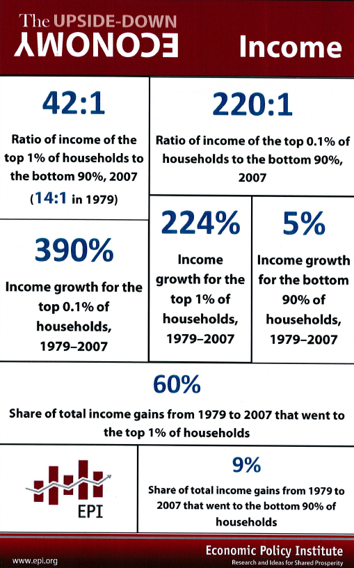
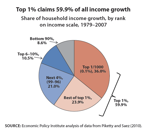
- The top 1 percent of households have secured a very large share of all of the gains in income—59.9 percent of the gains from 1979–2007, while the top 0.1 percent seized an even more disproportionate share—36 percent. In comparison, only 8.6 percent of income gains have gone to the bottom 90 percent. The patterns are similar for wages and capital income.
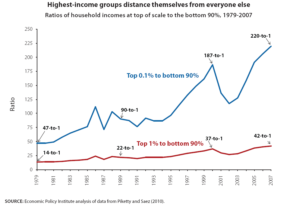
- As they have accrued a large share of income gains, the incomes of the top 1 percent of households have pulled far away from the incomes of typical Americans. In 2007, average annual incomes of the top 1 percent of households were 42 times greater than incomes of the bottom 90 percent (up from 14 times greater in 1979) and incomes of the top 0.1 percent were 220 times greater (up from 47 times greater in 1979).
- The financial sector’s share of the overall economy has roughly doubled in recent decades, and now stands at 7.6 percent of total national income. Relative to this sector’s share in 1979, this translates into an extra $547 billion in compensation and profits claimed by the sector—a trend with questionable social payoff.
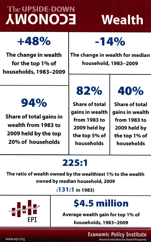
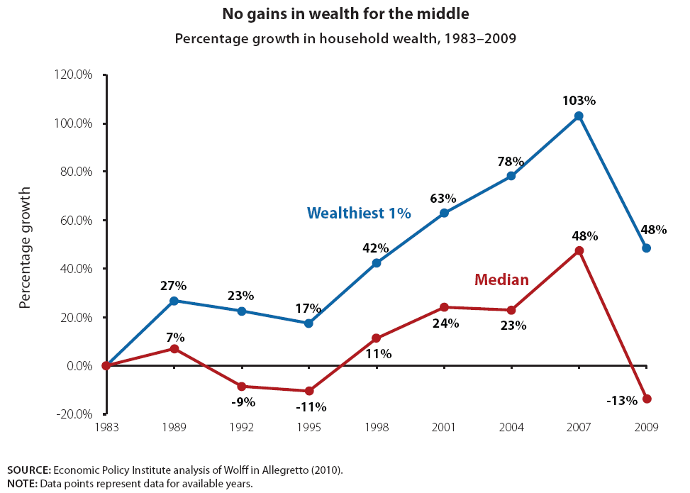
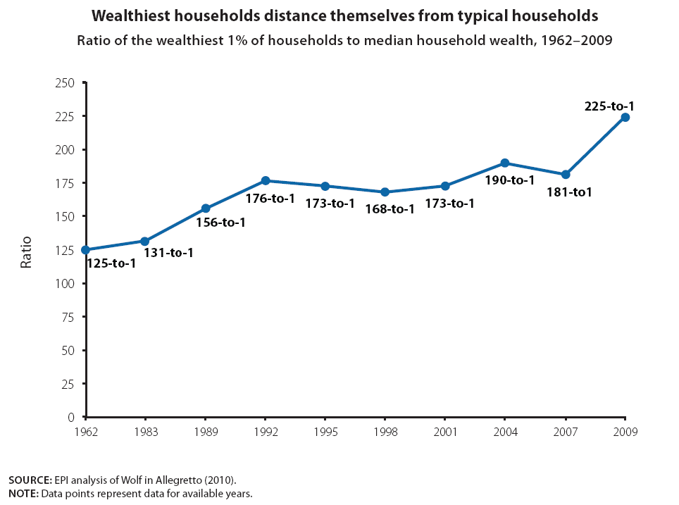
- Growth in wealth, not just incomes, has also become greatly skewed in recent decades. Most of the wealth gains of the last generation went to those who already had the most wealth, a group increasingly distant from the vast American middle-class. The wealth of the median household actually declined over this time period. As a result, in 2009, wealth held by the wealthiest 1 percent of households was 225 times greater than that held by the median household.
The effect of policy on income and wealth inequality
No one who has looked at trends in economic inequality in the United States in recent decades could dispute the dramatic increase in the share of all income claimed by the richest subgroups—especially the highest-earning 1 percent referred to by Occupy Wall Street activists when they say they represent the 99 percent of Americans left behind. Mishel, Bernstein, and Shierholz (2009) present a comprehensive review of these trends and Piketty and Saez (2010, updating earlier reports) explore in more depth the gains enjoyed by the top 1 percent.
Quick Facts: The Upside-Down Economy
Download and print half-sheet fliers that provide easy-to-understand information about the widening gap in economic status between the bottom 99 percent and the top 1 percent of Americans. The fronts provide numerical facts about the subject area while the backs contain definitions, explanations, and an elaboration of each issue:
There is some disagreement around the edges of the debate concerning just how dramatic this income-share increase was or when exactly it happened—was it steady and continuous, or the result of a couple of discrete “jumps”? And there are those who discount the seriousness of the divide, saying that middle-class incomes are managing to grow despite the huge increase in the top earners’ share. But no serious analyst denies that the top 1 percent (of households or tax-units or families) has seen a very large increase in incomes and in share of total income since the late 1970s.
Public policy, either through commission or omission, has played a central role in the increasing concentration of income. For example, Baker (2006), Bivens (2010), and Hacker and Pierson (2010) have all documented the role of various policies in generating greater inequality. The decade-long surge in income inequality occurred in pre-tax incomes, driven by developments in both major kinds of market-based incomes, namely the wage and salary incomes from work, and capital incomes (realized capital gains, interest, dividends) from wealth. And we know that the most obvious way policy can affect incomes—through taxes—has clearly aided the widening of the income gap. The Congressional Budget Office (CBO) shows that even as their share of total incomes more than doubled between 1979 and 2007, the richest 1 percent of household’s effective federal tax rate fell from 37 percent to 29.5 percent.
The clear policy tilt in favor of the highest-income households in the completely visible realm of taxes suggests that this group receives preferential treatment in the much more opaque policy decisions that get made in Washington every day. For example, Bartels (2007) shows how policymakers give much larger weight to the preferences of richer constituents.
What the Occupy Wall Street movement has done with its “We are the 99 percent” campaign is to remind Americans that economic outcomes are not just like the weather, something that must simply be endured and adapted to rather than forced to change. Instead, economic outcomes are shaped by political decisions. This insight is valuable because it confers the power to challenge the status quo, which is often preserved by claims that economic rewards are doled out through simple meritocracy and that any interference with market outcomes will wreck the economy. It’s not so. Markets are always shaped by policy, and policies in the United States have been shaped to benefit the already well-off. Changing the rules to ensure that rewards are more broadly shared can lead to an economy that is both more efficient and more fair.
The widening income gap
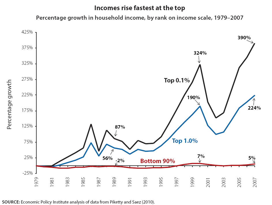
Figures A–C display trends in growth of overall market incomes, including wages and salaries as well as interest, dividend, and capital income generated by holding wealth. In the long period before the current recession, from 1979 to 2007, inflation-adjusted average annual incomes of the highest-income 1 percent of households grew by 224 percent, as shown in Figure A. Those even better off, the top 0.1 percent (the highest-income one one-thousandth of households), saw their incomes grow by 390 percent. In contrast, incomes of the bottom 90 percent grew just 5 percent between 1979 and 2007—and all of that growth occurred in the unusually strong income growth that occurred from 1997 to 2000, a period followed by declining income from 2000 to 2007.1 These data include all sources of market-based incomes such as wages and salaries, dividend and interest income, and realized capital gains, but do not include government transfer income (such as Social Security income or unemployment benefits).
Because of their vastly greater income growth, the highest-earning 1 percent of households have rapidly distanced themselves from the vast majority (the bottom 90 percent). As Figure B shows, average annual incomes of the top 1 percent of households in 1979 were 14 times greater than incomes of the bottom 90 percent; by 2007 incomes of the top 1 percent were 42 times greater. The income gap between the upper 0.1 percent of households and the bottom 90 percent grew even more, from a top-to-bottom ratio of 47-to-1 in 1979 to 220-to-1 in 2007.
The vastly greater income growth of the top highest-income 1 percent of households also obtained a much larger share of income growth than the vast majority (the bottom 90 percent). As shown in Figure C, the top 1 percent gained 59.9 percent of all the income growth generated between 1979 and 2007. In contrast, the bottom 90 percent received just 8.6 percent of all the income generated over the same period. It’s illuminating to note that the bottom 90 percent were able to claim just one-fourth of what the top one one-thousandth of households claimed from the growth of that period (36 percent).
Rising inequality in income from work
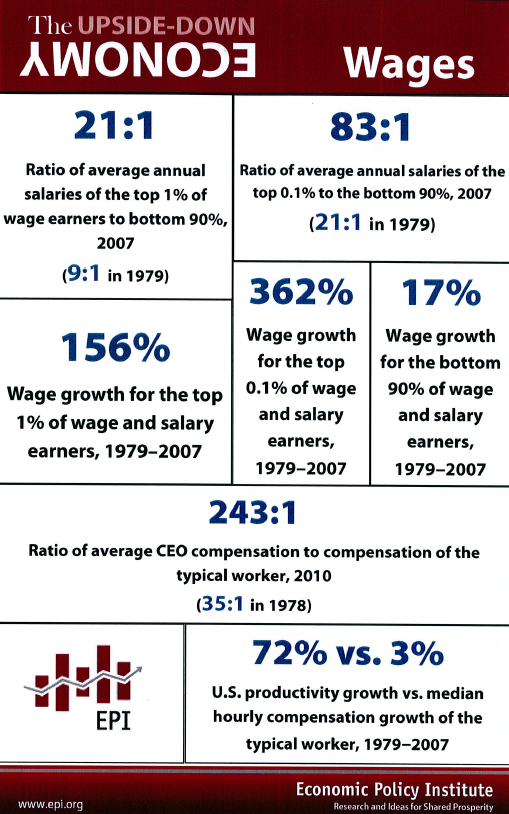
Figures D–F examine the rising inequality of wage and salary income—in other words, income from work. Labor earnings are by far the most evenly distributed sources of overall income because, after all, the vast majority of non-retired households have members that work. Yet labor earnings have become much more unequally distributed in recent decades. Figure D shows that the top 1 percent of wage and salary earners increased their inflation-adjusted average annual salaries by 144% from 1979 to 2006. The top one one-thousandth (0.1 percent) of earners enjoyed annual wages growth of 324 percent over that same period.
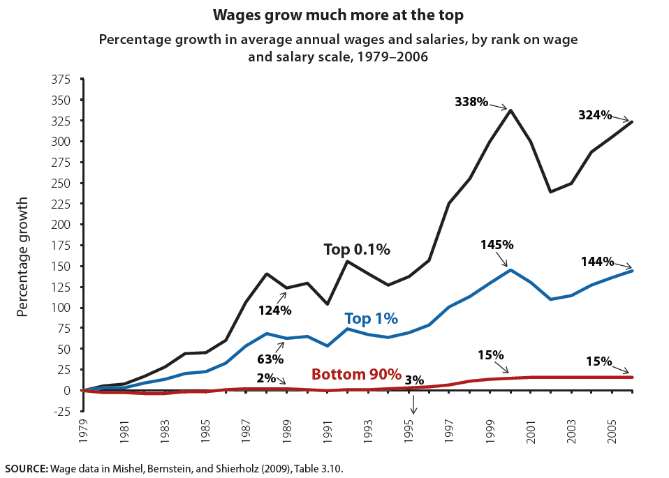
In contrast, the bottom 90 percent of wage earners increased their annual salaries by about 15 percent from 1979 to 2006. Most of this growth occurred during the relatively brief period of tight labor markets that accompanied the late 1990s boom. Between 1979 and 1995, average annual wages for the lowest-earning 90 percent grew just 2.8 percent. And from 2000 and 2006, wages did not improve at all. Thus, nearly all of the wage and salary growth of the bottom 90 percent from 1979 to 2006 occurred from 1995 to 2000 when unemployment was falling and then remained low.2
As with overall incomes, the disparity in wage growth has significantly widened the gap in salary levels between the top earners and everyone else, as shown in Figure E. In 1979 average annual salaries of the top 1 percent of wage earners were 9.4 times that of those in the bottom 90 percent, but by 2000 the gap had more than doubled to 20-to-1, a level that was maintained until 2006.
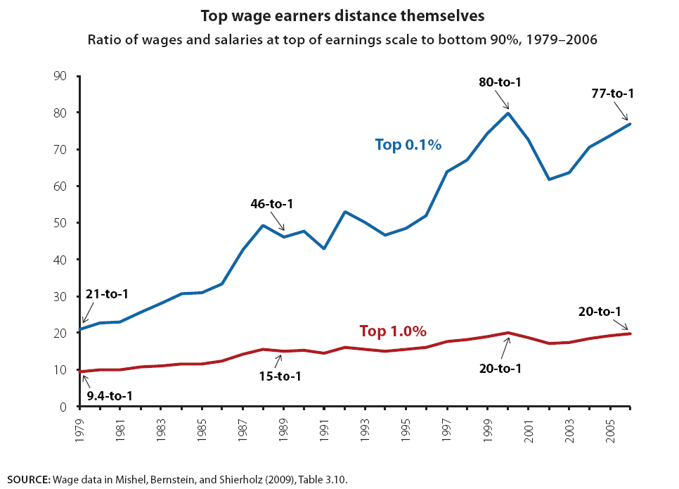
The very highest-wage earners—those in the upper 0.1 percent (the top one one-thousandth)—increased their distance from the earners in the bottom 90 percent even more rapidly; the ratio of their earnings to those in the bottom 90 percent rose from 21-to-1 in 1979 to 80-to-1 in 2000. This gap shrank after the stock market bubble burst in the late 1990s (wage data include the “realized stock options” that top corporate officers receive) but had nearly recovered its former size by 2006.
Figure F looks directly at the ratio of average compensation earned by the chief executive officers of large firms relative to the compensation of typical workers. In 1978, CEO compensation was 35 times greater than that of the typical worker, up from 24 times as great in 1965. After 1979 the pay of CEOs skyrocketed; by 2000 their pay was 299 times that the pay of a typical worker.
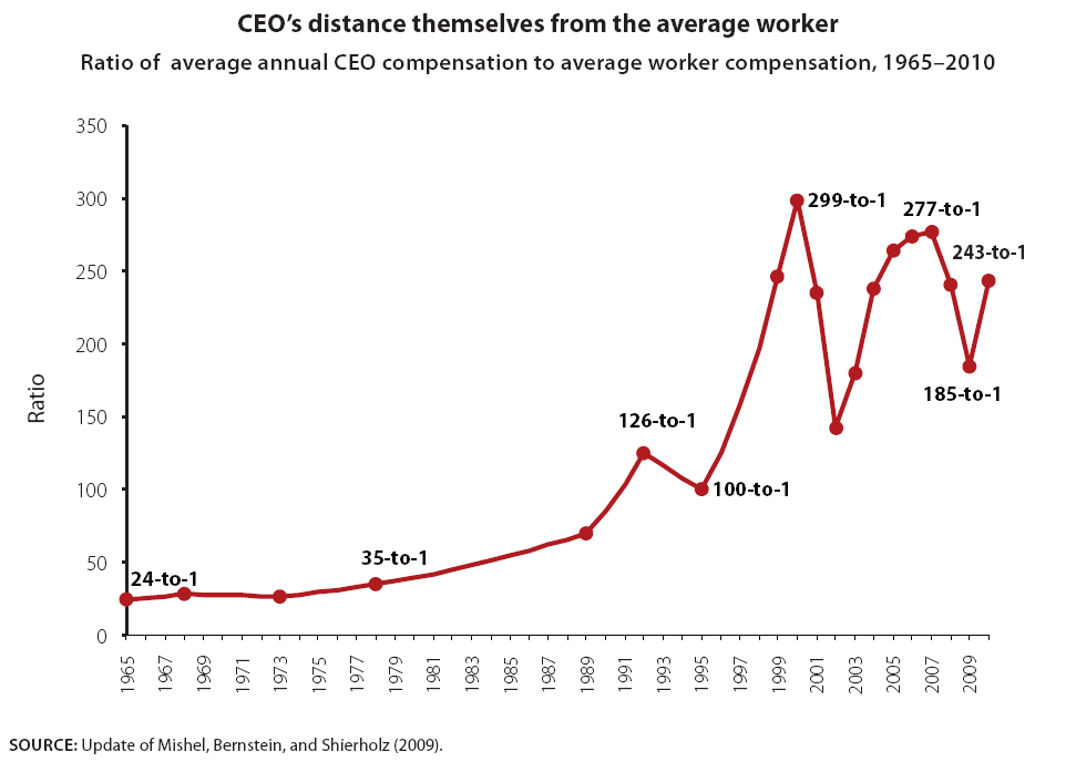
That level of CEO pay was admittedly somewhat inflated by the stock market boom in the late 1990s, and retreated significantly after the tech bubble burst. However, by 2007, CEO pay had nearly restored itself, attaining a ratio of 277-to-1 relative to pay of a typical worker. CEO pay fell again relative to typical workers in the Great Recession but is again reestablishing itself in the recovery. In 2010, the ratio of 243-to-1 was the fifth highest of any year since 1965. At this rate, it will likely not take long for the gap to reach its prior peak.3
Increasing concentration of income from wealth-holding
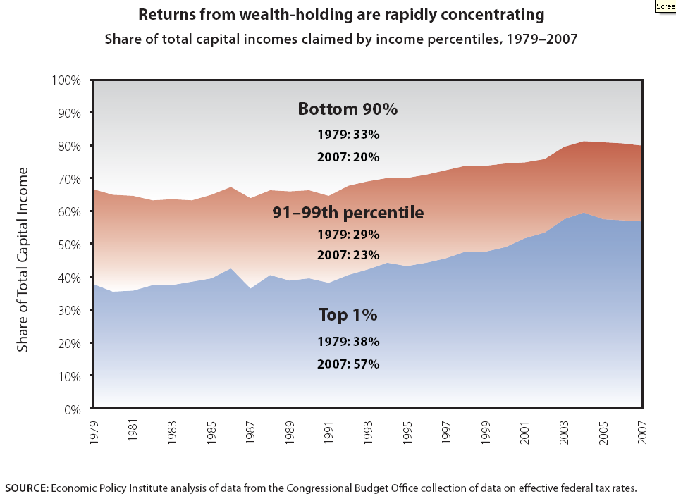
Figures G–H show that the trend of rapidly growing concentration in overall income and labor earnings is also apparent in the growth of income earned from wealth-holding, often labeled either “unearned” or “capital” income. Essentially, capital incomes are always and everywhere less equally distributed than wage income. As shown in Figure G, in 1979 the top 1 percent of households on the income scale already claimed 38 percent of all capital income generated in the economy. By 2007 this share had ballooned to 57 percent. The next richest 9 percent saw their share of capital incomes shrink from 29 percent in 1979 to 23 percent in 2007. And the bottom 90 percent, which collected 33 percent of capital incomes in 1979, claimed only 20 percent by 2007. This startling concentration of already unequally distributed capital incomes defies the logic of claims that there is a natural limit to how much of the fruits of economic growth can go to any one group.
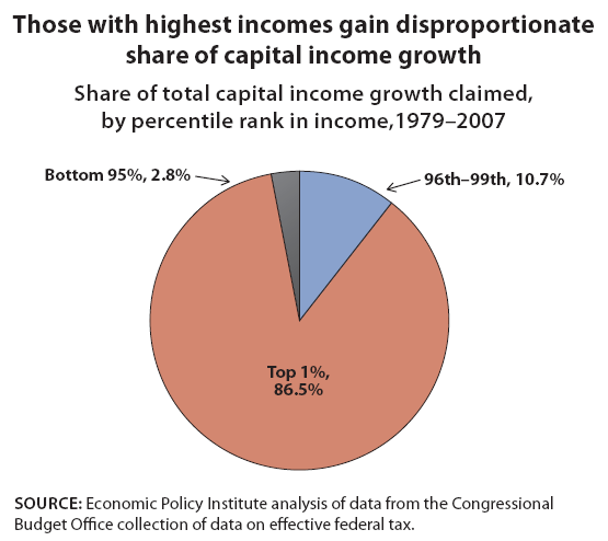
The very large rise in the share of all capital incomes collected by the highest-income 1 percent since 1979 means that this group has also collected a disproportionate share of the growth in these incomes over the same period. Basically, if the top 1 percent’s share of all capital incomes had remained constant between 1979 and 2007, they would have claimed 37 percent of capital income growth in the economy in those years. Instead, as Figure H shows, the top 1 percent alone collected a whopping 86.5 percent of growth in capital incomes during this period.4 The next highest-income 4 percent claimed 10.7 percent of all capital income growth while the bottom 95 percent claimed just 2.8 percent of the growth in these incomes. This figure departs from the convention of the other charts in not isolating the bottom 90 percent because their average capital incomes fell between 1979 and 2007, registering as negative capital income growth, which is hard to depict in a pie chart.
The financial sector’s increasing claim on growth
Much of the rising share of total income claimed by the top-earning 1 percent is associated with the rise of the financial sector, which is a dominant employer at the top. Figure I shows the share of total gross domestic product, or national income, attributable to compensation and profits in the corporate financial sector. Between 1929—just before the Great Depression ended the first Gilded Age—and 1973, this share fell from 3.7 percent to 3.2 percent. But between 1973 and 2007, this share more than doubled, to nearly 7 percent.
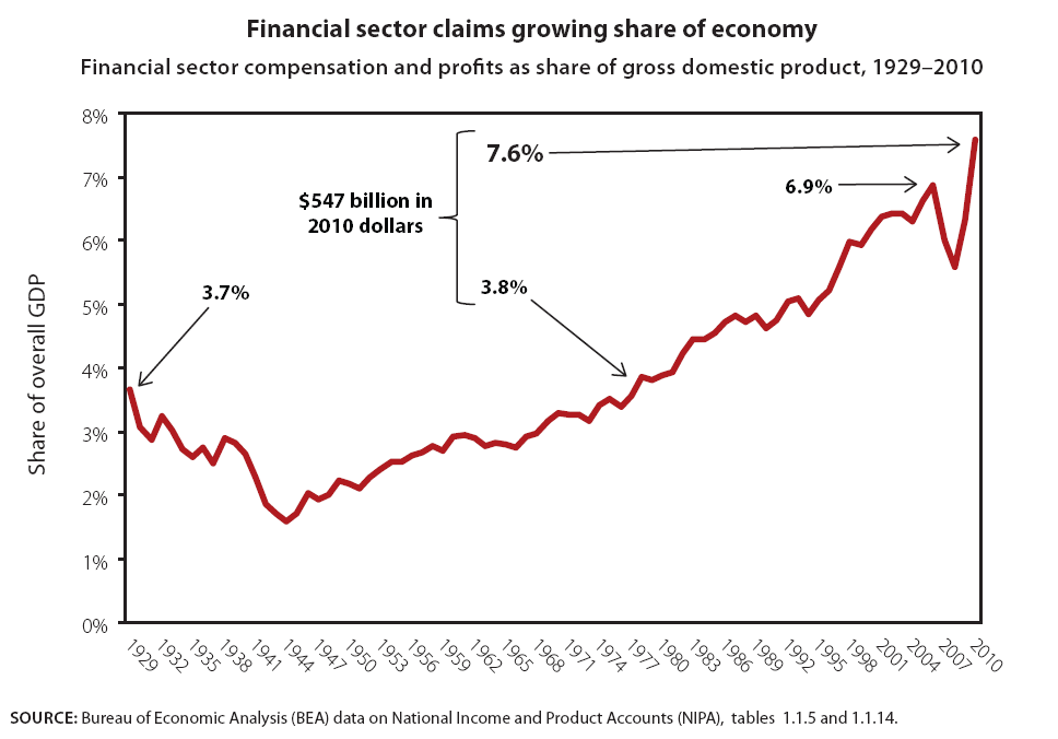
And financial sector compensation and profits’ share of GDP rebounded quickly from the dip of the Great Recession and actually passed its pre-recession peak. By 2010, in fact, the rising share of finance translates into an extra $547 billion claimed by this sector relative to the case where its share had remained at its 1979 level (3.8 percent). This is serious money. The payoff to these larger claims made by the financial sector are dubious. For example, business investment in plant and equipment (i.e., the productivity-generating investment that financial firms are supposed to make cheaper and safer) did not rise between 1973 and 2007. Residential investment, outside of the bubble-inflated mid-2000s, has also failed to show any persistent upward climb during the time that the financial sector has claimed an ever-larger piece of the pie. It is, in short, not off-base to wonder whether there is any return to forking over a much larger share of economic activity to the financial sector.
The concentration of wealth
The concentration of wealth has mirrored trends in the concentration of income. Wealth is a measure of a household’s assets (such as real estate, stocks, bonds, and cash) minus their liabilities (such as home mortgages and other personal debt). The only available data covering recent decades dates back to 1983 and shows that the wealth held by the wealthiest 1% of households grew far more than the wealth of the median household, whose wealth was actually lower in 2009 than in 1983. Figure J shows that the wealth of the top 1 percent grew over the 1980s and ‘90s and by 2007 was 103 percent greater than in 1983. The financial crisis in 2008 reduced the wealth of those at the top but by 2009 their wealth remained 48 percent greater than in 1983. The median household’s wealth fared far worse. After falling in the early 1990s the median household’s wealth rose and was 48 percent greater in 2007 than in 1983. But the fall of wealth in the financial crisis was sharper for those in the middle than at the top because those in the middle have much of their wealth in housing, values of which fell dramatically after the housing bubble burst. By 2009 the median household’s wealth had fallen so much that their wealth was 13.5 percent less than what it was in 1983.5
Not surprisingly, the gap between the wealth of those at the top and those in the middle substantially grew over the last few decades, as Figure K shows. In 1983 the wealthiest 1 percent of households had wealth that was 131 times greater than wealth of the median household. This gap grew until the early 1990s and again in the 2000s, and by 2009 the top 1 percent had 225 times as much wealth as the median household.6
Perhaps more startlingly, more than 94 percent of the gains in wealth from 1983 to 2009 accrued to the top fifth of wealthiest households, with 40.2 percent of the gains going to the wealthiest 1 percent and 41.5 percent going to the next wealthiest 4 percent of households (Figure L). This translated to gains among the wealthiest 1 percent of $4.5 million per household and gains among the next wealthiest 4 percent of roughly $1.2 million per household.7
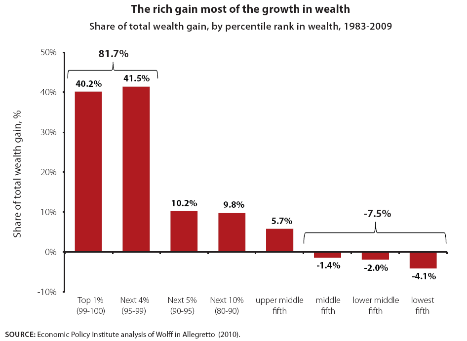
In other words, the richest 5 percent of households obtained roughly 82 percent of all the nation’s gains in wealth between 1983 and 2009. The bottom 60 percent of households actually had less wealth in 2009 than in 1983, meaning they did not participate at all in the growth of wealth over this period.
Basing policy in the true picture of income and wealth
The insights offered by the data on income, wealth, and inequality should shape the economic policy debate going forward. Most immediately, they should inform budget deficit debates about what the United States can “afford.” The nation can easily afford more federal government support aimed at reducing today’s historically high and persistent rates of joblessness. In fact it is the cheapest option in all major economic respects (Mishel 2011).
Once the current crisis of joblessness has passed and smaller imbalances between federal investment and revenues are appropriately targeted, attention should turn to supporting the same level of economic security and dignity that we have provided for generations. This would mean ending the unnecessary calls to close budget deficits by cutting the benefits provided by Social Security, Medicare, and Medicaid.
Thirty years of economic data show that the U.S. economy has generated significant levels of income and should continue to do so into the future; in other words, there is no economic constraint that mandates that we scale back expectations for living standards growth in coming years (Mishel 2011). But this vast income that has been generated has been distributed in an extremely skewed fashion; typical American families have not benefitted from it nearly as much as they could have. This is a political problem that, if solved, has the potential to make our country more fair and the vast majority of its citizens more prosperous.
The politics of economic policymaking may be broken, but the U.S. economy is not broke, the data show. The country does have the economic wherewithal to provide a decent standard of living for all.
Endnotes
1. Economic Policy Institute analysis of “Table A6: Top fractiles income levels (including capital gains) in the United States” from “Income Inequality in the United States, 1913-1998” with Thomas Piketty, Quarterly Journal of Economics, 118(1), 2003, 1-39 (Longer updated version published in A.B. Atkinson and T. Piketty eds., Oxford University Press, 2007) (Tables and Figures updated to 2008 in Excel format, July 2010).
2. Based on Table 3.10 in Mishel, Bernstein, and Shierholz (2009), which uses data from Kopczuk, Saez and Song (2007), Table A-3. Data in Table 3.10 for 2006 was extrapolated from 2004 data using growth rates from Social Security Administration wage statistics (http://www.ssa.gov/OACT/COLA/awidevelop.html). SSA provides data on share of total wages and employment in annual wage brackets such as for those earning between $95,000.00 and $99,999.99. We employ the midpoint of the bracket to compute total wage income in each bracket and sum all brackets. Our estimate of total wage income was 99.1 percent of the actual. We used interpolation to derive cutoffs building from the bottom up to obtain the 0–90 percent bracket and then estimating the remaining categories. This allowed us to estimate the wage shares for upper wage groups. To obtain absolute wage trends we used the SSA data on the total wage pool and employment and computed the real wage per worker (based on their share of wages and employment) in the different groups.
3. The CEO pay data are described in the table note for table 3.41 in Mishel, Bernstein, and Shierholz (2009).The compensation data for typical workers comes from the Bureau of Labor Statistics’ series on average hourly earnings of production, non-supervisory workers inflated to compensation using the ratio of compensation to wages in the Bureau of Economic Analysis National Income and Product Accounts.
4. The data in Figure G comes directly from the Congressional Budget Office, which calculates the share of all capital income going to various income groupings. Figure H is calculated by EPI with slightly different data, specifically the CBO estimates of average incomes’ sources of incomes by income groupings. What are being labeled as growth in capital incomes between 1979 and 2007 in Figure H are dividends, interest payments, capital gains, and “other business income,” which includes partnership income, income from S corporations, and rental income.
5. The data on wealth are based on Wolff’s analysis of the Federal Reserve Board’s Survey of Consumer Finances presented in Table 3 of Allegretto (2010)
6. Ibid.
7. Ibid.
References
Allegretto, Sylvia. 2009. The State of Working America’s Wealth, 2011: Through Volatility and Turmoil the Gap Widens. Economic Policy Institute Briefing Paper #292. Washington, D.C.: EPI.
Bartels, Larry M. 2008. Unequal Democracy: The Political Economy of the New Gilded Age. Princeton, N.J.: Princeton University Press.
Bivens, Josh. 2011. Failure by Design: The Story behind America’s Broken Economy. An Economic Policy Institute Book. Ithaca, N.Y.: ILR Press, an imprint of Cornell University Press.
Congressional Budget Office (CBO). June 2010. “Average Federal Tax Rates for All Households, by Comprehensive Household Income Quintile.” Washington, D.C.: CBO. http://www.cbo.gov/publications/collections/tax/2010/all_tables.pdf
Hacker, Jacob S. and Paul Pierson. 2010. Winner-Take-All Politics: How Washington Made the Rich Richer – And Turned Its Back on the Middle Class. New York: Simon & Schuster.
Mishel, Lawrence. 2011. We’re not broke nor will we be: Policy choices will determine whether rising national income leads to a prosperous middle class. Economic Policy Institute Briefing Paper #310. Washington, D.C.: EPI. http://www.epi.org/publication/were_not_broke_nor_will_we_be/
Mishel, Lawrence, Jared Bernstein, and Heidi Shierholz. 2009. The State of Working America 2008/2009. An Economic Policy Institute Book. Ithaca, N.Y.: ILR Press, an imprint of Cornell University Press.
Piketty, Thomas and Emmanuel Saez. 2010. Excel tables and figures with 2008 data updating “Income Inequality in the United States, 1913–1998,” Quarterly Journal of Economics, 118(1), 2003, 1–39 (longer updated version published in A.B. Atkinson and T. Piketty eds., Oxford University Press, 2007).
