Back | Gender pay gap calculator
You are paid than the same as a comparable .
Your salary falls at the percentile among working with the same age and education as you. A comparable is paid . earning are actually paid the same as comparable . This pay equivalence only happens in your specific demographic combination within a range of four dollars. earning below $18,096 $18,095 actually make less more than comparable . This is the only group where men earn less than women. A similar to you is paid .
The gender wage gap is a big problem, and it’s not the only thing we have to worry about.
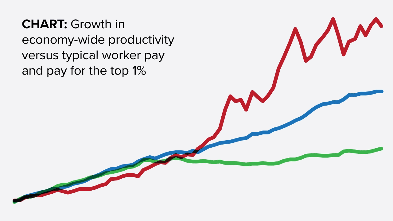
Most working people—women and men—have been hurt by skyrocketing inequality over the last 40 years. Take a look at the chart to see how.
How much did this growth of inequality affect your pay?
Back | Gender pay gap calculator
If inequality hadn't risen and we closed the gender wage gap, you could be paid per year, and so could like you.
inequality pay gap
That’s a raise of ! Although that's a pay cut for you, it's a raise of for those .
We need to change the rules so that a growing economy benefits all working people. Show me how.
Source: Economic Policy Institute | Methodology
Share the Gender pay gap calculator.
How do gender and inequality affect your pay? Find out how much you could be making in a more equal economy.
Embed the Gender pay gap calculator.
Methodology
The gender wage gap compares the wages of men and women at the same point in the wage distribution for their age and education cohort. For example, a 30-year-old college-educated woman whose wages fall at the 47th percentile among 25–34-year-old college-educated women will be compared with the 47th-percentile wage of 25–34-year-old college-educated men.
Each cohort is identified by the following characteristics: Gender is defined as male and female; education is defined as college (college and/or advanced degree) and non-college (some college, high school diploma, or less than high school); and age groups are 18-24, 25-34, 35-44, 45-54, and 55-64 (ages outside this range are included in the neighboring age group).
To predict wages if overall economic inequality had not increased since 1979 (i.e., if wages had kept up with productivity, as they did in the three decades after World War II), we apply productivity growth to 1979 demographic cohorts' overall wages.
To calculate where a person falls in the wage distribution, we use annualized hourly wages to create ventile cut-offs (5th percentile, 10th percentile, 15th percentile, etc.) within each cohort’s wage distribution, overall and by gender. Based on the user's salary, we find a percentile by linearly extrapolating between the ventile cut-offs. Since we annualize wages (multiplying hourly wages by 2,080), part-time workers will find the most appropriate comparison by inputting salary as if they are full time.
Sources
Data for calculator: Bureau of Labor Statistics (BLS) Current Population Survey Outgoing Rotation Group (1979 and 2017)
Data for chart: The bottom line shows typical worker compensation (representing wages of production/nonsupervisory workers in the private sector from BLS Current Employment Statistics and benefits from the Bureau of Economic Analysis National Income and Product Accounts); top 1% line represents wages from Social Security Administration; net productivity data from EPI analysis of BLS Labor Productivity and Costs data.
Updated March 2018
